Posts tagged ‘CAPE’
Chasing Headlines

It’s been an amazing start to the year. First the market cratered on slowing China economic concerns, domestic recessionary fears, deteriorating oil prices, and negative interest rates abroad. In response to all these worries (and others), stocks dove more than -11% (S&P 500 Index) in January, before settling down. Subsequently, the market has made a screaming recovery, in part due to dovish monetary policy comments (i.e., reduction in forecasted interest rate hikes) and diminished anxiety over a potential global collapse. Month-to-date stocks are up an impressive +5.4%, and year-to-date equities are flattish, or down less than -1%.
With an endless amount of information flowing across our smart phones and computers, it becomes quite easy and tempting to chase news headlines, just like a hyper dog chasing a car. But even once an investor catches up (or reacts) to a headline, there’s confusion around how to profit from the fleeting information. First of all, every plugged-in hedge fund and institutional investor has likely already traded on the stale information you received. Second of all, rarely is the data relevant to the long-term cash generating capabilities of the company or economy. And lastly, the news is more often than not, instantly factored into the stock price. Chasing news headlines only eaves individual investors holding the bag of performance-shattering transactions costs, taxes, and worn-out pricing.
The heightened volatility in late 2015 and early 2016 hasn’t however prevented investors and so-called pundits from attempting to time the market. Any battle-tested investment veteran knows it’s virtually impossible to consistently time the market (see also Market Timing Treadmill), but this fact hasn’t prevented speculators from attempting the feat nonetheless. Famed investment guru, Peter Lynch, who earned an average +29% annual return from 1977-1990, summed it up well when he stated the following:
“Far more money has been lost by investors preparing for corrections, or trying to anticipate corrections, than has been lost in corrections themselves.”
The Important Factors
As I’ve written many times in the past, the keys to long-term stock performance are not knee-jerk reactions to headlines, but rather these following crucial factors (see also Don’t Be a Fool, Follow the Stool):
- Profits
- Interest Rates
- Sentiment
- Valuations
On the profit growth front, corporate income has been pressured by numerous headwinds over the last few years, including an export-shattering increase in the value of the U.S. dollar and a profit-squeezing collapse in energy sector earnings. As you can see from the chart below, the value of the U.S. dollar increased by about 25% from mid-2014 to early-2015, in part because of diverging global central bank policies (more hawkish U.S. Fed vs. more dovish ECB/international central banks). Since that spike, the dollar has settled into a broad range (95 – 100), and the former forceful headwind have now turned into modest tailwinds. This trend is important because an estimated 35-40% of corporate profits are derived from international operations.
Adding insult to injury, the roughly greater than -70% decline in forward energy earnings over the last 18 months has caused a significant hit to overall S&P 500 profits. The tide appears to be finally turning (or at least stabilizing) however, as we’ve seen oil prices rebound by about +30% this year from the lows in January. If these aforementioned trends persist, profit pressures in 2016 are likely to abate significantly, and may actually become additive to growth.
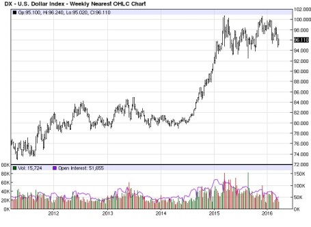
Source: Barchart.com
Profits are important, but so are interest rates. While incessant talk about the path of future Fed policy continues to blanket the airwaves (see also Fed Fatigue), absent a rapid increase in interest rates (say 300-400 basis points), interest rates remain unambiguously positive for equity markets, providing a floor for the oft-repeated volatility in financial markets. As long as stocks are providing higher yields than many bonds, and depositors are earning 0% (or negative rates) on their checking accounts, stocks may remain unloved, but not forgotten.
And speaking of unloved, the sentiment for stocks remains sour. One need look no further than the quarter-billion dollars in hemorrhaging outflows out of U.S. equity funds (see ICI Long-Term Mutual Fund Flows) since 2014. This deep underlying skepticism serves as a positive contrarian indicator for future equity prices. Right now, very few individual investors are swimming in the pool – the time to get out of the stock market pool is when everyone is jumping in.
And lastly, valuations remain very much in line with historical averages (approximatqely 17x 2016 projected earnings), especially considering the generational low in interest rates. Bears continue to point to the elevated CAPE ratio, which has been a disastrous indicator the last seven years (and longer), as a reason to remain cautious. The ironic part is that valuations are virtually guaranteed to improve a few years from now as we roll off the artificially depressed years of 2008-2010.
When you add it all up, zero (or negative) interest rates, combined with the other key factors of profits, sentiment, and valuations, equities remain an important and attractive part of a diversified long-term portfolio. Your objectives, time horizon, and risk tolerance will always drive the proportion of your equity allocation. Nevertheless, some bond exposure is essential to smooth out volatility. Regardless of your investment strategy, chasing headlines, like a dog chasing a car, serves no purpose other than leaving you with a tired, unproductive investment portfolio.

Wade W. Slome, CFA, CFP®
Plan. Invest. Prosper.
DISCLOSURE: Sidoxia Capital Management (SCM) and some of its clients own certain exchange traded funds, but at the time of publishing SCM had no direct position in any other security referenced in this article. No information accessed through the Investing Caffeine (IC) website constitutes investment, financial, legal, tax or other advice nor is to be relied on in making an investment or other decision. Please read disclosure language on IC “Contact” page.
Yellen is “Yell-ing” About High Stock Prices!

Earlier this week, Janet Yellen, chair of the U.S. Federal Reserve, spoke at the Institute for New Economic Thinking conference at the IMF headquarters in Washington, D.C. In addition to pontificating about the state of the global economy and the direction of interest rates, she also decided to chime in with her two cents regarding the stock market by warning stock values are “quite high.” She went on to emphasize “there are potential dangers” in the equity markets.
Unfortunately, those investors who have hinged their investment careers on the forecasts of economists, strategists, and Fed Chairmen have suffered mightily. Already, Yellen’s soapbox rant about elevated stock prices is being compared to former Fed Chairman Alan Greenspan’s “Irrational Exuberance” speech, which I have previously discussed on numerous occasions (see Irrational Exuberance Déjà Vu).
Greenspan’s bubble warning talk was given on December 5, 1996 when the NASDAQ closed around 1,300 (it closed at 5,003 this week). Greenspan specifically said the following:
“But how do we know when irrational exuberance has unduly escalated asset values, which then become subject to unexpected and prolonged contractions as they have in Japan over the past decade?”
After his infamous speech, the NASDAQ index almost quadrupled in value to 5,132 in the ensuing three years before cratering by approximately -78%,
Greenspan’s successor, economics professor Ben Bernanke, didn’t fare much better than the previous Fed Chairmen. Unlike many, I give full credit where credit is due. Bernanke deserves extra credit for his nimble but aggressive actions that helped prevent a painful recession from expanding into a protracted and lethal depression.
With that said, as late as May 2007, Bernanke noted Fed officials “do not expect significant spillovers from the subprime market to the rest of the economy.” Moreover, in 2005, near the peak in housing prices, Bernanke said the probability of a housing bubble was “a pretty unlikely possibility.” Bernanke went on to add housing price increases, “largely reflect strong economic fundamentals.” Greenspan concurred with Bernanke. Just a year prior, Greenspan noted that the increase in home values was “not enough in our judgment to raise major concerns.” History has proven how Bernanke and Greenspan could not have been more wrong.
If you still believe Yellen is the bee’s knees when it comes to the investing prowess of economists, perhaps you should review Long Term Capital Management (LTCM) debacle. In the midst of the 1998 Asian financial crisis, Robert Merton and Myron Scholes, two world renowned Nobel Prize winners almost single handedly brought the global financial market to its knees. Merton and Scholes used their lifetime knowledge of economics to create complex computerized investment algorithms. Everything worked just fine until LTCM lost $500 million in one day, which required a $3.6 billion bailout from a consortium of banks.
NASDAQ 5,000…Bubble Repeat?
Janet Yellen’s recent prognostication about the valuation of the U.S. stock market happens to coincide with the NASDAQ index breaking through the 5,000 threshold, a feat not achieved since the piercing of the technology bubble in the year 2000. Investing Caffeine readers and investors of mine understand today’s NASDAQ index is much different than the NASDAQ index of 15 years ago (see also NASDAQ Redux), especially when it comes to valuation. The folks at Bespoke put NASDAQ 5,000 into an interesting context by adding the important factor of inflation to the mix. Even though the NASDAQ index is within spitting distance of its all-time high of 5,132 (reached in 2000), the index would actually need to rally another +40% to reach an all-time “inflation adjusted” closing high (see chart below).

Source: Bespoke Investment Group
Economists and strategists are usually articulate, and their arguments sound logical, but they are notorious for being horribly bad at predicting the future, Janet Yellen included. I agree valuation is an all-important factor in determining future stock market returns. Howeer, by Robert Shiller, Janet Yellen, and a host of other economists relying on one flawed metric (CAPE PE), they have not only been wildly wrong year after year, but they are recklessly neglecting many other key factors (see also Shiller CAPE Smells Like BS).
I freely admit stocks will eventually go down, most likely a garden variety -20% recessionary decline in prices. While from a historical standpoint we are overdue for another recession (about two recessions per decade), this recovery has been the slowest since World War II, and the yield curve is currently not flashing any warning signals. When the eventual stock market decline happens, it likely will not be driven by high valuations. The main culprit for a bear market will be a decline in earnings – high valuations just act as gasoline on the fire. Janet Yellen will continue to offer her opinions on many aspects of the economy, but if she steps on her soapbox again and yells about stock market valuations, you will be best served by purchasing a pair of earplugs.

Wade W. Slome, CFA, CFP®
Plan. Invest. Prosper.
DISCLOSURE: Sidoxia Capital Management (SCM) and some of its clients hold positions in certain exchange traded funds (ETFs), but at the time of publishing, SCM had no direct position in any other security referenced in this article. No information accessed through the Investing Caffeine (IC) website constitutes investment, financial, legal, tax or other advice nor is to be relied on in making an investment or other decision. Please read disclosure language on IC Contact page.
Why Buy at Record Highs? Ask the Fat Turkey

This article is an excerpt from a previously released Sidoxia Capital Management complementary newsletter (December 1, 2014). Subscribe on the right side of the page for the complete text.
I’ve fulfilled my American Thanksgiving duty by gorging myself on multiple helpings of turkey, mash potatoes, and pumpkin pie. Now that I have loosened my belt a few notches, I have had time to reflect on the generous servings of stock returns this year (S&P 500 index up +11.9%), on top of the whopping +104.6% gains from previous 5 years (2009-2013).
Conventional wisdom believes the Federal Reserve has artificially inflated the stock market. Given the perceived sky-high record stock prices, many investors are biting their nails in anticipation of an impending crash. The evidence behind the nagging investor skepticism can be found in the near-record low stock ownership statistics; dismal domestic equity fund purchases; and apathetic investor survey data (see Market Champagne Sits on Ice).
Turkey-lovers are in a great position to understand the predicted stock crash expected by many of the naysayers. As you can see from the chart below, the size of turkeys over the last 50+ years has reached a record weight – and therefore record prices per turkey:
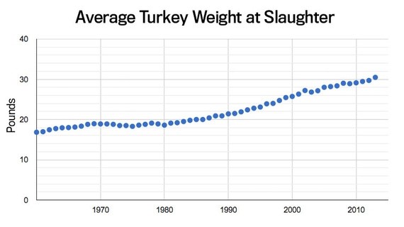
Source: The Atlantic
Does a record size in turkeys mean turkey meat prices are doomed for an imminent price collapse? Absolutely not. A key reason turkey prices have hit record levels is because Thanksgiving stomachs have been buying fatter and fatter turkeys every year. The same phenomenon is happening in the stock market. The reason stock prices have continued to move higher and higher is because profits have grown fatter and fatter every year (see chart below). Profits in corporate America have never been higher. CEOs are sitting on trillions of dollars of cash, and providing stock-investors with growing plump dividends (see also The Gift that Keeps on Giving), $100s of billions in shareholder friendly stock buybacks, while increasingly taking leftover profits to invest in growth initiatives (e.g., technology investments, international expansion, and job hiring).
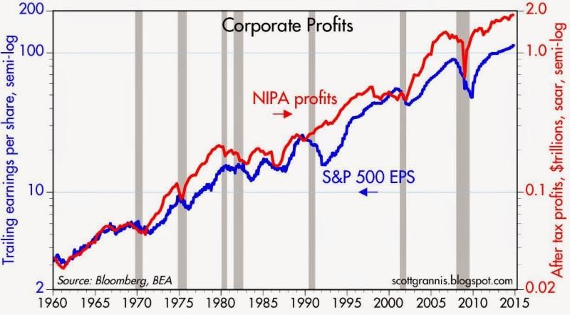
Source: Calafia Beach Pundit
Despite record turkey prices, I will make the bold prediction that hungry Americans will continue to buy turkey. More important than the overall price paid per turkey, the statistic that consumers should be paying more attention to is the turkey price paid per pound. Based on that more relevant metric, the data on turkey prices is less conclusive. In fact, turkey prices are estimated to be -13% cheaper this year on a per pound basis compared to last year ($1.58/lb vs. $1.82/lb).
The equivalent price per pound metric in the stock market is called the Price-Earnings (P/E) ratio, which is the price paid by a stock investor per $1 of profits (or earnings). Today that P/E ratio sits at approximately 17.5x. As you can see from the chart below, the current P/E ratio is reasonably near historical averages experienced over the last 50+ years. While, all else equal, anyone would prefer paying a lower price per pound (or price per $1 in earnings), any objective person looking at the current P/E ratio would have difficulty concluding recent stock prices are in “bubble” territory.
However, investor doubters who have missed the record bull run in stock market prices over the last five years (+210% since early 2009) have clung to a distorted, overpriced measurement called the CAPE or Shiller P/E ratio. Readers of my Investing Caffeine blog or newsletters know why this metric is misleading and inaccurate (see also Shiller CAPE Peaches Smell).
Don’t Be an Ostrich

While prices of stocks arguably remain reasonably priced for many Baby Boomers and retirees, the conclusion should not be to gorge 100% of investment portfolios into stocks. Quite the contrary. Everyone’s situation is unique, and every investor should customize a globally diversified portfolio beyond just stocks, including areas like fixed income, real estate, alternative investments, and commodities. But the exposures don’t stop there, because in order to truly have the diversified shock absorbers in your portfolio necessary for a bumpy long-term ride, investors need exposure to other areas. Such areas should include international and emerging market geographies; a diverse set of styles (e.g., Value, Growth, Blue Chip dividend-payers); and a healthy ownership across small, medium, and large equities. The same principles apply to your bond portfolio. Steps need to be taken to control credit risk and interest rate risk in a globally diversified fashion, while also providing adequate income (yield) in an environment of generationally low interest rates.
While I’ve spent a decent amount of time talking about eating fat turkeys, don’t let your investment portfolio become stuffed. The year-end time period is always a good time, after recovering from a food coma, to proactively review your investments. While most non-vegetarians love eating turkey, don’t be an investment ostrich with your head in the sand – now is the time to take actions into your own hands and make sure your investments are properly allocated.
Wade W. Slome, CFA, CFP®
Plan. Invest. Prosper.
DISCLOSURE: Sidoxia Capital Management (SCM) and some of its clients own a range of positions in certain exchange traded fund positions, but at the time of publishing SCM had no direct position in any other security referenced in this article. No information accessed through the Investing Caffeine (IC) website constitutes investment, financial, legal, tax or other advice nor is to be relied on in making an investment or other decision. Please read disclosure language on IC Contact page.
Mathematics 101: The Cheap Money Printing Machine

Like many other bloggers and pundits, I have amply pontificated on the relative attractiveness of the stock market. For years, cash and gold hoarding bears have clung to the distorted, money-losing Shiller CAPE P/E ratio (see CAPE Smells Like B.S.), which has incorrectly signaled investors to stay out of stocks and miss trillions of dollars in price appreciation. Apparently, the ironclad Shiller CAPE device has been temporarily neutralized by the Federal Reserve’s artificially cheapening money printing press policies, just like Superman’s strength being stripped by the nullifying powers of kryptonite. The money printing logic seems so elegantly sound, I felt compelled to encapsulate this powerful relationship in an equation:
Interests Rate Cuts + Printing Press On = Stocks Go Higher
Wow, amazing…this is arithmetic any investor (or 3rd grader) could appreciate! Fortunately for me, I have a child in elementary school, so I became emboldened to share my new found silver bullet equation. I initially received a few raised eyebrows from my child when I introduced the phrase “Quantitative Easing” but it didn’t take long before she realized Rate Cuts + QE = Fat Piggy Bank.
After the intensive tutorial, I felt so very proud. With a smile on my face, I gave myself a big pat on the back, until I heard my child say, “Daddy, after looking at this squiggly S&P 500 line from 2007-2014, can you help my brain understand because I have some questions.”
Here is the subsequent conversation:
Me: “Sure kiddo, go ahead shoot…what can I answer for you?”
Child: “Daddy, if the Federal Reserve is so powerful and you should “not fight the Fed,” how come stock prices went down by -58% from 2007 – 2009, even though the Fed cut rates from 5.25% to 0%?”
Me: “Uhhhh….”
Child: “Daddy, if stock prices went down so much after massive rate cuts, does that mean stock prices will go up when the Fed increases rates?”
Me: “Uhhhh….”
Child: “Daddy, if Quantitative Easing is good for stock prices, how come after the QE1 announcement in November 2008, stock prices continued to go down -25%?”
Me: “Uhhhh….”
Child: “Daddy, if QE makes stocks go up, how come stock prices are at all-time record highs after the Fed has cut QE by -$70 billion per month and is completely stopping QE by 100% next month?”
Me: “Uhhhh….”
Child: “Daddy, everyone is scared of rate increases but when the Fed increased interest rates by 250 basis points in 1994, didn’t stock prices stay flat for the year?”
Me: “Uhhhh….” (See also 1994 Bond Repeat)
What started as a confident conversation about my bullet-proof mathematical equation ended up with me sweating bullets.
Math 101A: Low Interest Rates = Higher Asset Prices
As my previous conversation highlights, the relationship between rate cuts and monetary policy may not be as clear cut as skeptics would like you to believe. Although I enjoy the widely covered Shiller CAPE discussions on market valuations, somehow the media outlets fail to make the all-important connection between interest rates and P/E ratios.
One way of framing the situation is by asking a simple question:
Would you rather have $100 today or $110 a year from now?
The short answer is…”it depends.” All else equal, the level of interest rates will ultimately determine your decision. If interest rates are offering 20%, a rational person would select the $100 today, invest the money at 20%, and then have $120 a year from now. On the other hand, if interest rates were 0.5%, a rational person would instead select the option of receiving $110 a year from now because collecting a $100 today and investing at 0.5% would only produce $100.50 a year from now.
The same time-value-of-money principle applies to any asset, whether you are referring to gold, cars, houses, private businesses, stocks, or other assets. The mathematical fact is, all else equal, a rational person will always pay more for an asset when interest rates are low, and pay less when interest rates are high. As the 200-year interest chart below shows, current long-term interest rates are near all-time lows.
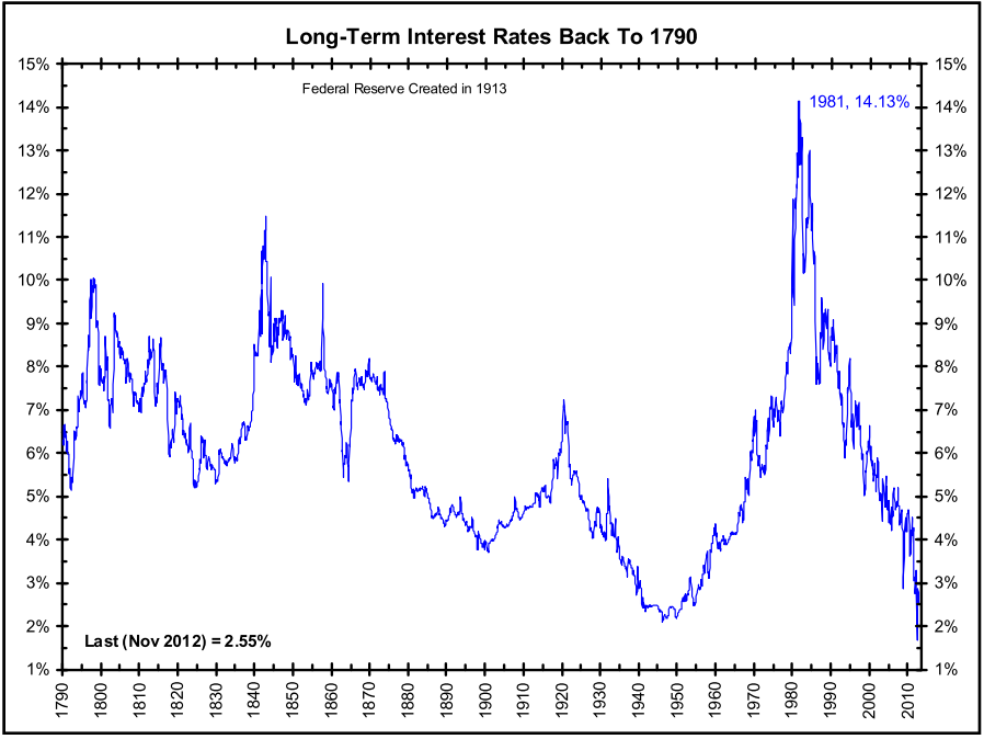
Source: The Big Picture
The peak in interest rates during the early 1980s correlated with a single digit P/E ratio (~8x). The current P/E ratio is deservedly higher (~16x), but it is dramatically lower than the 30x+ P/E ratio realized in the 2000 year timeframe. If none of this discussion makes sense, consider the simple Rule of 20 (see also The Rule of 20 Can Make You Plenty), which states as a simple rule-of-thumb, the average market P/E ratio should be equal to 20 minus the level inflation. With inflation currently averaging about 2%, the Rule of 20 implies an equilibrium of ~18x. If you assume this P/E multiple and factor in a 7-8% earnings growth rate, you could legitimately argue for 20% appreciation in the market to S&P 2,400 over a 12-month period. It’s true, a spike in interest rates, combined with a deceleration in earnings would justify a contraction in stock prices, but even under this scenario, current index values are nowhere near the bubble levels of 2000.
After six long years, the QE train is finally grinding to a halt, and a return towards Fed policy normalcy could be rapidly approaching. Many investors and skeptical bears have tried to rationalize the tripling in the market from early 2009 as solely due to the cheap Fed money printing machine. Unfortunately, history and mathematics don’t support that assertion. If you don’t believe me, perhaps a child may be able to explain it to you better.
Wade W. Slome, CFA, CFP®
Plan. Invest. Prosper.
DISCLOSURE: Sidoxia Capital Management (SCM) and some of its clients own a range of positions in certain exchange traded fund positions, but at the time of publishing SCM had no direct position in any other security referenced in this article. No information accessed through the Investing Caffeine (IC) website constitutes investment, financial, legal, tax or other advice nor is to be relied on in making an investment or other decision. Please read disclosure language on IC Contact page.
Shiller CAPE Peaches Smell Like BS

If something sounds like BS, looks like BS, and smells like BS, there’s a good chance you’re probably eyeball-deep in BS. In the investment world, I encounter a lot of very intelligent analysis, but at the same time I also continually step into piles of investment BS. One of those piles of BS I repeatedly step into is the CAPE ratio (Cyclically Adjusted Price-to-Earnings) created by Robert Shiller. For those who are not familiar with Shiller, he is a Nobel Prize winner in economics who won the award in 2013 for his work on the “empirical analysis of asset prices.” Shiller vaulted into fame in large part due to the timing of his book, Irrational Exuberance, which was published during the 2000 technology market peak. He gained additional street-credibility in the mid-2000s when he spoke about the bubble developing in the real estate markets.
What is the CAPE?
Besides being a scapegoat for every bear that has missed the tripling of stock prices in the last five years, the CAPE effectively is a simple 10-year average of the P/E ratio for the S&P 500 index. The logic is simple, like many theories in finance and economics, there often are inherent mean-reverting principles that are accepted as rules-of-thumb. It follows that if the current 10-year CAPE is above the 134-year CAPE average, then stocks are expensive and you should avoid them. On the other hand, if the current CAPE were below the long-term CAPE average, then stocks are cheap and you should buy. Here is a chart of the Shiller CAPE:
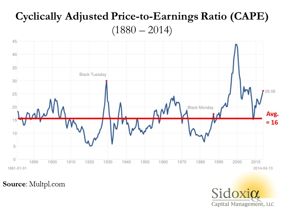
As you can see from the chart above, the current CAPE ratio of 26x is well above the 134-year average of 16x, which according to CAPE disciples makes the stock market very expensive. Or as a recent Business Insider article stated, the Shiller CAPE is “higher than at any point in the 20th century with the exception of the peaks of 1929 and 2000 – you know what happened after those.”
Problems Behind the Broken CAPE Tool
There are many problems with Shiller’s CAPE analysis, but let’s start with the basics by first asking, how useful has this tool actually been over the last, 10, 20, or 30 years? The short answer…not very. For example, if investors followed the implicit recommendation of the CAPE for the periods when Shiller’s model showed stocks as expensive (see above chart 1990 – 2014), they would have missed a more than quintupling (+469% ex-dividends) in the S&P 500 index. Over a shorter timeframe (2009 – 2014) the S&P 500 is up +114% ex-dividends (+190% since March 2009).
Even if you purchased at the worst time at the peak of the stock market in 2000 when the CAPE was 44 (S&P 500 – 1553), an investor would still have earned a total return of about +45% from 2000 – 2014, despite the CAPE still being 63% higher (more expensive) than the 134-year CAPE average of 16.
Peaches for $.25 Post-Bubble?
To illustrate a point, let’s assume you are a peach lover and due to a bubble in peach demand, prices spiked to an elevated level of $2.60 per pound for 9 years, but in year 10 the price plummeted to $.25 per pound today (see chart below). Assuming the 134-year average for peach prices was $1.60 per pound, would you still want to purchase your beloved peaches for the fire sale price of $.25 per pound? Common sense tells you $.25/lb. is a bargain, but if you asked the same question to Robert Shiller, he would say absolutely “NO”! The 10-year Peach CAPE ratio would be $2.37 ([9 yrs X $2.60] + [1 yr X $.25]) #1, but since the 10-year CAPE is greater than the LT-Average peach price of $1.60 per pound #2, Shiller would say peaches are too expensive, even though you could go to Kroger (KR) and buy a pound of peaches today for $0.25 #3.
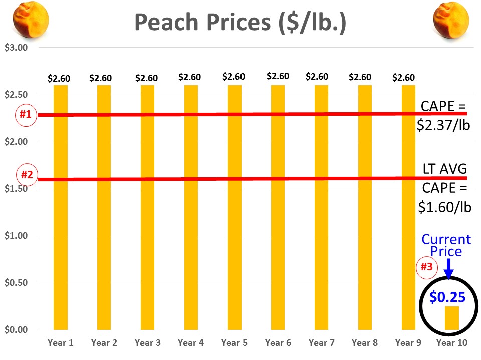
This complete neglect of current market prices in the calculation of CAPE makes absolutely no sense, but this same dynamic of ignoring current pricing reality is happening today in the stock market. Effectively what’s occurring is the higher P/E ratios experienced over the last 10 years are distorting the Shiller CAPE ratio, thereby masking the true current value of stocks. In other words the current CAPE of 26x vastly exaggerates the pricey-ness of the actual S&P 500 P/E ratio of 16x for 2014 and 14x for 2015.
There are plenty of other holes to poke into CAPE, but the last major component of Shiller’s ratio I want to address is interest rates. Even if you disregard my previous negative arguments against Shiller’s CAPE, should anyone be surprised that the ratio troughed in the early 1980s of 7x when long-term interest rates peaked. If I could earn 18% on a CD with little risk in 1981, not many people should be dumbfounded that demand for risky stocks was paltry. Today, the reverse environment is in place – interest rates are near record lows. It should therefore come as no surprise, that all else equal, a higher P/E (and CAPE) is deserved when interest rates are this low. Nevertheless, this discussion of P/E and CAPE rarely integrates the critical factor of interest rates.
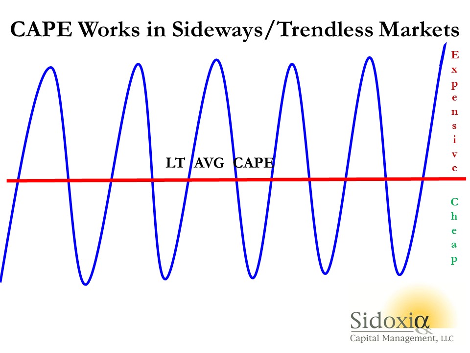
While I have spent a decent amount of time trashing the CAPE-BS ratio, I want to give my pal Bob Shiller a fair shake. I can do this by looking into a mirror and admitting there are periods when the CAPE ratio can actually work. Although the CAPE is effectively useless during long, multi-year upward and downward trending markets (think bubbles & depressions), the CAPE makes perfect sense in sideway, trendless markets (see chart below).
The investing public is always looking for a Holy Grail financial indicator that will magically guide them to riches in both up and down markets. Despite the popularity of Shiller’s CAPE ratio, regrettably no one perfect indicator exists. So before you jump on the bandwagon and chase the hot indicator du jour, make sure to look down and make sure you haven’t stepped in any Shiller CAPE-BS.
Wade W. Slome, CFA, CFP®
Plan. Invest. Prosper.
DISCLOSURE: Sidoxia Capital Management (SCM) and some of its clients hold long positions in certain exchange traded funds, but at the time of publishing SCM had no direct position in KR, or any other security referenced in this article. No information accessed through the Investing Caffeine (IC) website constitutes investment, financial, legal, tax or other advice nor is to be relied on in making an investment or other decision. Please read disclosure language on IC Contact page.


