Archive for September, 2014
Mathematics 101: The Cheap Money Printing Machine

Like many other bloggers and pundits, I have amply pontificated on the relative attractiveness of the stock market. For years, cash and gold hoarding bears have clung to the distorted, money-losing Shiller CAPE P/E ratio (see CAPE Smells Like B.S.), which has incorrectly signaled investors to stay out of stocks and miss trillions of dollars in price appreciation. Apparently, the ironclad Shiller CAPE device has been temporarily neutralized by the Federal Reserve’s artificially cheapening money printing press policies, just like Superman’s strength being stripped by the nullifying powers of kryptonite. The money printing logic seems so elegantly sound, I felt compelled to encapsulate this powerful relationship in an equation:
Interests Rate Cuts + Printing Press On = Stocks Go Higher
Wow, amazing…this is arithmetic any investor (or 3rd grader) could appreciate! Fortunately for me, I have a child in elementary school, so I became emboldened to share my new found silver bullet equation. I initially received a few raised eyebrows from my child when I introduced the phrase “Quantitative Easing” but it didn’t take long before she realized Rate Cuts + QE = Fat Piggy Bank.
After the intensive tutorial, I felt so very proud. With a smile on my face, I gave myself a big pat on the back, until I heard my child say, “Daddy, after looking at this squiggly S&P 500 line from 2007-2014, can you help my brain understand because I have some questions.”
Here is the subsequent conversation:
Me: “Sure kiddo, go ahead shoot…what can I answer for you?”
Child: “Daddy, if the Federal Reserve is so powerful and you should “not fight the Fed,” how come stock prices went down by -58% from 2007 – 2009, even though the Fed cut rates from 5.25% to 0%?”
Me: “Uhhhh….”
Child: “Daddy, if stock prices went down so much after massive rate cuts, does that mean stock prices will go up when the Fed increases rates?”
Me: “Uhhhh….”
Child: “Daddy, if Quantitative Easing is good for stock prices, how come after the QE1 announcement in November 2008, stock prices continued to go down -25%?”
Me: “Uhhhh….”
Child: “Daddy, if QE makes stocks go up, how come stock prices are at all-time record highs after the Fed has cut QE by -$70 billion per month and is completely stopping QE by 100% next month?”
Me: “Uhhhh….”
Child: “Daddy, everyone is scared of rate increases but when the Fed increased interest rates by 250 basis points in 1994, didn’t stock prices stay flat for the year?”
Me: “Uhhhh….” (See also 1994 Bond Repeat)
What started as a confident conversation about my bullet-proof mathematical equation ended up with me sweating bullets.
Math 101A: Low Interest Rates = Higher Asset Prices
As my previous conversation highlights, the relationship between rate cuts and monetary policy may not be as clear cut as skeptics would like you to believe. Although I enjoy the widely covered Shiller CAPE discussions on market valuations, somehow the media outlets fail to make the all-important connection between interest rates and P/E ratios.
One way of framing the situation is by asking a simple question:
Would you rather have $100 today or $110 a year from now?
The short answer is…”it depends.” All else equal, the level of interest rates will ultimately determine your decision. If interest rates are offering 20%, a rational person would select the $100 today, invest the money at 20%, and then have $120 a year from now. On the other hand, if interest rates were 0.5%, a rational person would instead select the option of receiving $110 a year from now because collecting a $100 today and investing at 0.5% would only produce $100.50 a year from now.
The same time-value-of-money principle applies to any asset, whether you are referring to gold, cars, houses, private businesses, stocks, or other assets. The mathematical fact is, all else equal, a rational person will always pay more for an asset when interest rates are low, and pay less when interest rates are high. As the 200-year interest chart below shows, current long-term interest rates are near all-time lows.
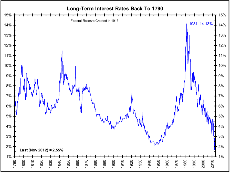
Source: The Big Picture
The peak in interest rates during the early 1980s correlated with a single digit P/E ratio (~8x). The current P/E ratio is deservedly higher (~16x), but it is dramatically lower than the 30x+ P/E ratio realized in the 2000 year timeframe. If none of this discussion makes sense, consider the simple Rule of 20 (see also The Rule of 20 Can Make You Plenty), which states as a simple rule-of-thumb, the average market P/E ratio should be equal to 20 minus the level inflation. With inflation currently averaging about 2%, the Rule of 20 implies an equilibrium of ~18x. If you assume this P/E multiple and factor in a 7-8% earnings growth rate, you could legitimately argue for 20% appreciation in the market to S&P 2,400 over a 12-month period. It’s true, a spike in interest rates, combined with a deceleration in earnings would justify a contraction in stock prices, but even under this scenario, current index values are nowhere near the bubble levels of 2000.
After six long years, the QE train is finally grinding to a halt, and a return towards Fed policy normalcy could be rapidly approaching. Many investors and skeptical bears have tried to rationalize the tripling in the market from early 2009 as solely due to the cheap Fed money printing machine. Unfortunately, history and mathematics don’t support that assertion. If you don’t believe me, perhaps a child may be able to explain it to you better.

Wade W. Slome, CFA, CFP®
Plan. Invest. Prosper.
DISCLOSURE: Sidoxia Capital Management (SCM) and some of its clients own a range of positions in certain exchange traded fund positions, but at the time of publishing SCM had no direct position in any other security referenced in this article. No information accessed through the Investing Caffeine (IC) website constitutes investment, financial, legal, tax or other advice nor is to be relied on in making an investment or other decision. Please read disclosure language on IC Contact page.
Investing with Crayons

At one level, investing can be extremely challenging if you consider the plethora of diverse and unpredictable factors such as monetary policy, fiscal policy, wars, banking crises, natural disasters, currency crises, geopolitical turmoil, Ebola, Scottish referendums, etc. On the other hand, investing (not trading or speculating) should be quite simple…like drawing stick figures with a crayon. However, simplicity does not mean laziness. Successful stock research requires rigorous due diligence without cutting corners. Once the heavy research lifting is completed, concise communication is always preferred.
In order to be succinct, investors need to understand the key drivers of stock performance. In the short run, investors may not be able to draw the directional path of stock prices, but over the long run, Peter Lynch described stock predictions best (see Inside the Investing Genius) when he stated:
“People may bet on hourly wiggles of the market but it’s the earnings that waggle the wiggle long term.”
In other words, if revenues, earnings, and most importantly cash flows go up over the long-term, then it is highly likely that stock prices will follow. Besides profits, interest rates and sentiment are other key contributing factors affecting the trajectory of future stock prices.
In high school and college, students often cram as much information into a paper with the goal of layering pages as high as possible. Typically, the heaviest papers got A’s and the lightest papers got C’s or D’s. However, as it relates to stock analysis, the opposite holds true – brevity reigns supreme.
American psychologist and philosopher William James noted, “The art of being wise is the art of knowing what to overlook.”
In our digital world of informational overload, knowing what to overlook is quite a challenge. I experienced this dynamic firsthand early on in my professional career when I was an investment analyst. When asked to research a new stock by my portfolio manager, often my inclination was to throw in the data kitchen sink into my report. Rather than boil down the report to three or four critical stock-driving factors, I defaulted to a plan of including every possible risk factor, competitor, and valuation metric. This strategy was designed primarily as a defense mechanism to hedge against a wide range of possible outcomes, whether those outcomes were probable or very unlikely. Often, stuffing irrelevant information into reports resulted in ineffectual, non-committal opinions, which could provide cosmetic wiggle room for me to rationalize any future upward or downward movement in the stock price.
Lynch understood as well as anyone that stock investing does not have to be complex rocket science:
“Everyone has the brainpower to follow the stock market. If you made it through fifth-grade math, you can do it.”
In fact, when Lynch worked with investment analysts, he ran a three-minute timer and forced the analysts to pitch stock ideas in basic terms before the timer expired.
If you went back further in time, legendary Value guru Benjamin Graham also understood brain surgery is not required to conduct successful equity analysis:
“People don’t need extraordinary insight or intelligence. What they need most is the character to adopt simple rules and stick to them.”
Similarly, Warren Buffett hammers home the idea that a gargantuan report or extravagant explanation isn’t required in equity research:
“You should be able to explain why you bought a stock in a paragraph.”
Hedge fund veteran manager Michael Steinhardt held the belief that a stock recommendation should be elegant in its simplicity as well. In his book No Bull – My Life In and Out of Markets he states that an analyst “should be able to tell me in two minutes, four things: 1) the idea; 2) the consensus view; 3) his variant perception; and 4) a trigger event.
All these previously mentioned exceptional investors highlight the basic truth of equity investing. A long, type-written report inundated with confusing charts and irrelevant data is counterproductive to the investment and portfolio management process. Outlining a stock investment thesis is much more powerful when succinctly written with a crayon.
Wade W. Slome, CFA, CFP®
Plan. Invest. Prosper.
DISCLOSURE: Sidoxia Capital Management (SCM) and some of its clients own a range of positions in certain exchange traded fund positions, but at the time of publishing SCM had no direct position in any other security referenced in this article. No information accessed through the Investing Caffeine (IC) website constitutes investment, financial, legal, tax or other advice nor is to be relied on in making an investment or other decision. Please read disclosure language on IC Contact page.
NASDAQ 5,000…Irrational Exuberance Déjà Vu?

Investors love round numbers and with the Dow Jones Industrial index recently piercing 17,000 and the S&P 500 index having broken 2,000 , even novice investors have something to talk about around the office water cooler. While new all-time records are being set for the major indices during September, the unsung, tech-laden NASDAQ index has yet to surpass its all-time high of 5,132 achieved 14 and ½ years ago during March of 2000.
A lot has changed since then. Leading up to the pricking of the technology bubble, talks of an overhyped market started as early as December 5, 1996, when then Federal Reserve Chairman Alan Greenspan made his infamous “irrational exuberance” speech.
“But how do we know when irrational exuberance has unduly escalated asset values, which then become subject to unexpected and prolonged contractions as they have in Japan over the past decade?”-Alan Greenspan (Federal Reserve Chairman 1987 – 2006)
On that date, the NASDAQ closed at 1,300. A little over three years later, before values cratered by -78%, the index almost quadrupled higher to 5,132. Looked at from a slightly different lens, here is how the major indexes have fared since Greenspan’s widely referenced speech almost 18 years ago:

Despite the world’s most powerful banker calling stock prices irrational, the Dow & S&P have almost tripled in value (+164% & +167%, respectively) and the NASDAQ has almost quadrupled (+251%). The 80%+ outperformance (excluding dividends) is impressive, but reasonable if you consider this increase amounts to about a +7.2% compounded annual appreciation value. Investors have experienced a lot of heartburn over that long timeframe, but for any buy-and-holders, these returns would have trounced returns realized in alternative safe haven vehicles like CDs, savings accounts, or bonds.
Price: The Almighty Metric
There are many valuation metrics to evaluate but the most universal one is the Price/Earnings ratio (P/E). Just as in the process of assessing the value of a car, house, or stock, the price you pay is usually the most important factor of the purchase. The same principle applies to stock indexes. The cheaper the price paid, the greater probability of earning superior returns in the future. Unfortunately for investors in technology stocks, there was not much value in the NASDAQ index during late-1999, early-2000. Historical P/E data for the NASDAQ index is tough to come by, but some estimates pegged the index value at 200x’s its earnings at the peak of the 2000 technology mania. In other words, for every $1 in profit the average NASDAQ company earned, investors were willing to pay $200…yikes.
Today, the NASDAQ 100 index (the largest 100 non-financial companies in the NASDAQ index), which can serve as a proxy for the overll NASDAQ index, carries a reasonable P/E ratio of approximately 20x on a forward basis (24x on a trailing basis) – about 90% lower than the peak extremes of the NASDAQ index in the year 2000.
Although NASDAQ valuations are much lower today than during the bursting 2000 tech bubble, P/E ratios for the NASDAQ 100 still remain about +20% higher than the S&P 500, which begs the question, “Is the premium multiple deserved?”
As I wrote about in the NASDAQ Tech Revolution, you get what you pay for. If you pay a peanut multiple, many times you get a monkey stock. In the technology world, there is often acute obsolescence risk (remember Blackberry – BBRY?) that can lead to massive losses, but there also exists a winner-takes-all dynamic. Just think of the dominance of Google (GOOG/L) in search advertising, Microsoft (MSFT) in the PC, or Amazon (AMZN) in e-commerce. It’s a tricky game, but following the direction of cash, investments, and product innovation are key in my mind if you plan on finding the long-term winners. For example, the average revenue growth for the top 10 companies in the NASDAQ 100 averaged more than +100% annually from the end of 1999 to the end of 2013. Identifying the “Old Tech Guard” winners is not overly challenging, but discovering the “New Tech Guard” is a much more demanding proposition.
In the winner-takes-all hunt, one need not go any further than looking at the massive role technology plays in our daily lives. Twenty years ago, cell phones, GPS, DVRs (Digital Video Recorders), e-Readers, tablets, electric cars, iPods/MP3s, WiFi mobility, on-demand digital media, video-conferencing, and cloud storage either did not exist or were nowhere near mainstream. Many of these technologies manifest themselves into a whole host of different applications that we cannot live without. One can compile a list of these life-critical applications by thumbing through your smartphone or PC bookmarks. The list is ever-expanding, but companies like Twitter (TWTR), Facebook (FB), Amazon (AMZN), Uber, Netflix (NFLX), Priceline (PCLN), Yelp, Zillow (Z), and a bevy of other “New Tech Guard” companies have built multi-billion franchises that have become irreplaceable applications in our day-to-day lives.
Underlying all the arbitrary index value milestones (e.g., Dow 17,000 and S&P 2,000) since the 1990s has a persistent and unstoppable proliferation of technology adoption across virtually every aspect of our lives. NASDAQ 5,000 may not be here quite yet, but getting there over the next year or two may not be much of a stretch. Speculative tendencies could get us there sooner, and macro/geopolitical concerns could push the milestone out, but when we do get there the feeling of NASDAQ 5,000 déjà vu will have a much stronger foundation than the fleeting euphoric emotions felt when investors tackled the same level in year 2000.
Wade W. Slome, CFA, CFP®
Plan. Invest. Prosper.
DISCLOSURE: Sidoxia Capital Management (SCM) and some of its clients own AAPL, GOOG/L, AMZN, NFLX bonds (short the equity), FB (non-discretionary), MSFT (non-discretionary), PCLN (non-discretionary) and a range of positions in certain exchange traded fund positions, but at the time of publishing SCM had no direct position in TWTR, Uber, YELP, Z, or any other security referenced in this article. No information accessed through the Investing Caffeine (IC) website constitutes investment, financial, legal, tax or other advice nor is to be relied on in making an investment or other decision. Please read disclosure language on IC Contact page.
Back to the Future: Mag Covers (Part I)
Magazine Covers Part II – – – Magazine Covers Part III
I’m not referring to the movie, Back to the Future, about a plutonium-powered DeLorean time machine that finds Marty McFly (played by Michael J. Fox) traveling back in time. Rather, I am shining the light on the uncanny ability of media outlets (specifically magazines) to mark key turning points in financial markets – both market bottoms and market tops. This will be the first in a three part series, providing a few examples of how magazines have captured critical periods of maximum fear (buying opportunities) and greed (selling signals).
People tend to have short memories, especially when it comes to the emotional rollercoaster ride we call the stock market. Thanks to globalization, the internet, and the 24/7 news cycle, we are bombarded with some fear factor to worry about every day. Although I might forget what I had for breakfast, I have been a student of financial market history and have experienced enough cycles to realize as Mark Twain famously stated, “History never repeats itself, but it often rhymes” (read previous market history article). In that vein, let us take a look at a few covers from the 1970s:

Newsweek’s “The Big Bad Bear” issue came out on September 9, 1974 when the collapse of the so-called “Nifty Fifty” (the concentrated set of glamour stocks or “Blue Chips”) was in full swing. This group of stocks, like Avon, McDonalds, Polaroid, Xerox, IBM and Disney, were considered “one-decision” stocks investors could buy and hold forever. Unfortunately, numerous of these hefty priced stocks (many above a 50 P/E) came crashing down about 90% during the1973-74 period.
Why the glum sentiment? Here are a few reasons:
- Exiting Vietnam War
- Undergoing a Recession
- 9% Unemployment
- Arab Oil Embargo
- Watergate: Presidential Resignation
- Franklin National Failure

A cartoon from the same bearish 1974 cover article.
Not a rosy backdrop, but was this scary and horrific phase the ideal time to sell, as the magazine cover may imply? No, actually this was a shockingly excellent time to purchase equities. The Dow Jones Industrial Average, priced at 627 when the magazine was released, is now trading around 10,247…not too shabby a return considering the situation looked pretty darn bleak at the time.
Reports of the Market’s Death Greatly Exaggerated

Sticking with the Mark Twain theme, the reports of the market’s demise was greatly exaggerated too – much the same way we experienced the overstated reaction to the financial crisis early in 2009. BusinessWeek’s August 13, 1979 magazine captured the essence of the bearish mood in the article titled, “The Death of Equities.” This article came out, of course, about 18 months before a multi-decade upward explosion in prices that ended in the “Dot-com” crash of 2000. In the late 1970s, inflation reached double digit levels; gold and oil had more than doubled in price; Paul Volcker became the Federal Reserve Chairman and put on the economic brakes via a tough, anti-inflationary interest rate program; and President Jimmy Carter was dealing with an Iranian Revolution that led to the capture of 63 U.S. hostages. Like other bear market crashes in our history, this period also served as a tremendous time to buy stocks. As you can see from the chart above, the Dow was at 833 at the time of the magazine printing – in the year 2000, the Dow peaked at over 14,000.
This walk down memory lane is not complete. Conveniently, the Back to the Future story was designed as a trilogy (just like my three-part magazine review). You can relive Parts II & III here: Magazine Covers Part II – – – Magazine Covers Part III
Wade W. Slome, CFA, CFP®
Plan. Invest. Prosper.
DISCLOSURE: Sidoxia Capital Management (SCM) has a short position in MCD at the time this article was originally posted. SCM owns certain exchange traded funds, IBM, and DIS, but currently has no direct position in Avon (AVP), Polaroid, Xerox (XRX). No information accessed through the Investing Caffeine (IC) website constitutes investment, financial, legal, tax or other advice nor is to be relied on in making an investment or other decision. Please read disclosure language on IC “Contact” page.
Market Champagne Sits on Ice

Summer may be coming to an end, but the heat in the stock market has not cooled down, as the stock market registered its hottest August performance in 14 years (S&P 500 index up +3.8%). With these stellar results, one would expect the corks to be popping, cash flowing into stocks, and the champagne flowing. However, for numerous reasons, we have not seen this phenomenon occur yet. Until the real party begins, I suppose the champagne will stay on ice.
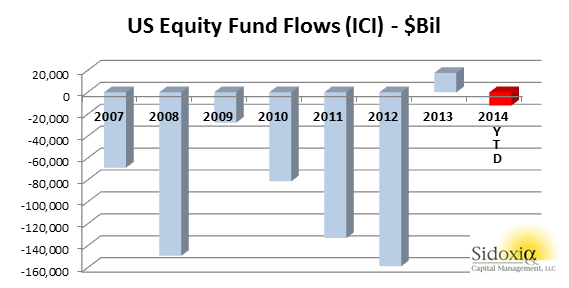
At the end of last year, I wrote further about the inevitable cash tsunami topic in an article entitled, “Here Comes the Dumb Money.” At that point in time, stocks had remarkably logged an approximate +30% return, and all indications were pointing towards an upsurge of investor interest in the stock market. So far in 2014, the party has continued as stocks have climbed another +8.4% for the year, but a lot of the party guests have not arrived yet. With the water temperature in the pool being so enticing, one would expect everyone to jump in the stock market pool. Actually, we have seen the opposite occur as -$12 billion has been pulled out of U.S. stock funds so far in 2014 (see ICI chart below).
How can the market be up +8.4% when money is coming out of stocks? For starters, companies are buying stock by the hundreds of billions of dollars. An estimated $480 billion of stock was purchased by corporations last year via share repurchase authorizations. Adding fuel to the stock fire are near record low interest rates. The ultra-low rates have allowed companies to borrow money at unprecedented rates for the purpose of not only buying back chunks of stock, but also buying the stock of whole companies (Mergers & Acquisitions). Thomson Reuters estimates that M&A activity in 2014 has already reached $2.2 trillion, up more than +70% compared to the same period last year.
Another factor contributing to the lackluster appetite for stocks is the general public’s apathy and disinterest in the market. This disconnected sentiment was captured beautifully by a recent Gallup survey, which asked people the following question:
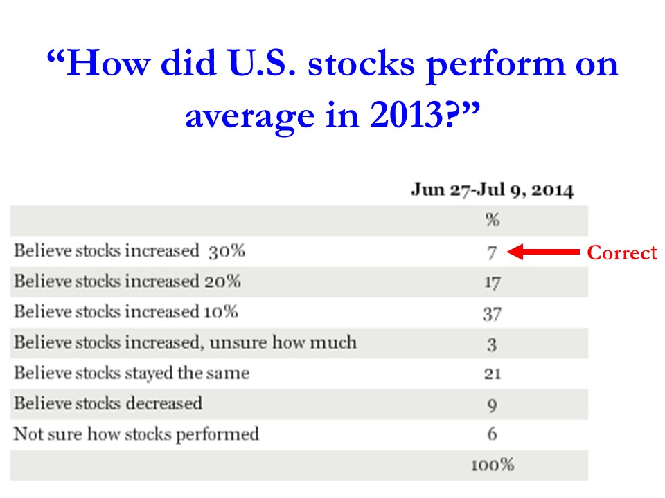
As you can see, only 7% of the respondents realized that stocks were up by more than +30% in 2013. More specifically, the S&P 500 (Large Cap) index was up +29.6%, S&P 600 (Small Cap) +39.7%, and the S&P 400 (Mid Cap) +31.6% (all percentages exclude dividends). Despite these data points, if taken with near 15-year low household stock ownership data, the results prove sentiment is nowhere near the euphoric phases reached before the 2000 bubble burst or the 2006-2008 real estate collapse.
Beyond the scarring effects of the 2008-2009 financial crisis, tempered moods regarding stocks can also be attributed to fresher geopolitical concerns (i.e., military tensions in Ukraine, Islamic extremists in Iraq, and missile launches from the Gaza Strip). The other area of never-ending anxiety is Federal Reserve monetary policy. The stock market, which has tripled in value from early 2009, has skeptics continually blaming artificial Quantitative Easing/QE policies (stimulative bond purchases) as the sole reason behind stocks advance. With current Fed Chair Janet Yellen pulling 70% of the QE punch bowl away (bond purchases now reduced to $25 billion per month), the bears are having a difficult time explaining rising stock prices and declining interest rates. Once all $85 billion in monthly QE purchases are expected to halt in October, skeptics will have one less leg on their pessimistic stool to sit on.
Economy and Profits Play Cheery Tune
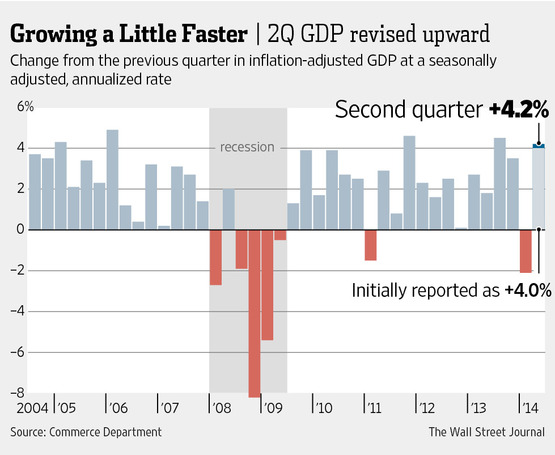
While geopolitical and Federal Reserve clouds may be preventing many sourpusses from joining the stock party, recent economic and corporate data have party attendees singing a cheery tune. More specifically, the broadest measurement of economic activity, GDP (Gross Domestic Product), came in at a higher-than-expected level of +4.2% for the 2nd quarter (see Wall Street Journal chart below).
Moreover, the spike in July’s Durable Goods orders also paints a healthy economic picture (see chart below). The data is volatile (i.e., Boeing Co orders – BA), nevertheless, CEO confidence is on the rise. Improved confidence results in executives opening up their wallets and investing more into their businesses.
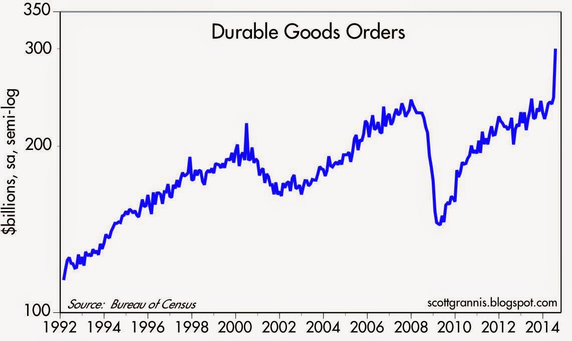
Source: Calafia Beach Pundit
Last but not least, the lifeblood of appreciating stock prices (earnings/profits) have been accelerating higher. In the most recent quarterly results, we saw a near doubling of the growth rate from 1st quarter’s +5% growth rate to 2nd quarter’s +10% growth rate (see chart below).
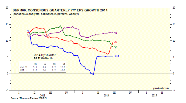
Source: Dr. Ed’s Blog
With the S&P 500 continuing to make new record highs despite scary geopolitical and Federal Reserve policy concerns, the stock market party is still waiting for guests to arrive. When everyone arrives and jumps in the pool, it will be time to pop the corks and sell. Until then, there is plenty of appreciation potential as the champagne sits on ice.


