Posts tagged ‘Scott Grannis’
Spring Has Sprung: Market Weather Turning

This article is an excerpt from a previously released Sidoxia Capital Management complimentary newsletter (April 1, 2016). Subscribe on the right side of the page for the complete text.
It was a cold winter for stocks, but as we approached the spring season in March, the flowers have begun to bloom. More specifically, during the month of March, the Dow Jones Industrial index catapulted +7.1% and the S&P 500 index jumped +6.6%. While this roughly +80% annualized rate is unlikely to sustain itself, this flurry of strong performance could be the sign of warmer weather conditions in the economic forecast.
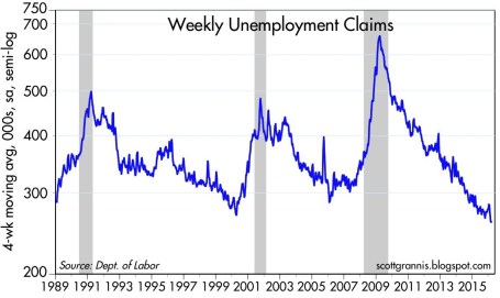
What started out as a cold and blustery January, with stocks posting one of the worst beginning months in history (S&P 500 down -5.1%), quickly thawed out in February and March. Fears over deteriorating economic conditions in the U.S., China along with plummeting oil prices proved fleeting. In fact, as Scott Grannis at Calafia Beach Pundit pointed out, there is no sign of recession in the U.S. as evidenced by a 43-year low in unemployment claims and a 4.9% unemployment rate (see chart below).
As I’ve stated for many years, focusing on the never-ending hurricane of pessimistic headlines is a wasteful use of time and destructive force on performance, if acted upon. Offsetting the downpour of negative news stories are the record low interest rates (now incomprehensibly negative in parts of the globe), which serve as a protective umbrella against the short-term stormy volatility. When investors face the soggy reality of earning a near-0% return on their bank savings and a sub-2% Treasury bond market for 10-year maturities, suddenly a 6-7% earnings yield on stocks certainly looks pretty sunny. There have been very few times in history when dividends earned on stocks have exceeded the payments received on a 10 year Treasury bond, but that is exactly the extreme environment we are living in today. No doubt, if the interest rate climate changes, and rates spike higher, stocks will face a more thunderous environment.
However, fortunately for stock market investors (and unfortunately for savers), this week Federal Reserve Chair Janet Yellen reiterated her forceful view of maintaining interest rates at a low, stimulative level for an extended period of time.
If It Bleeds It Leads – At the Expense of Your Portfolio
Even in the face of European terrorist attacks in Brussels and a turbulent (but entertaining) political presidential election season, the four pillars of earnings, interest rates, valuations, and sentiment are still protecting stock investors from an economic flood (see also Don’t Be a Fool, Follow the Stool). Scary news headlines may sell newspapers and attract advertising dollars, but the real money is made by following the four investing pillars.
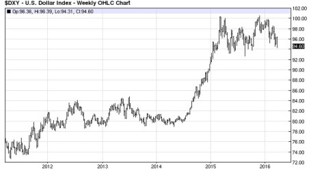
Also contributing to a clearer outlook this spring is the steadying value of the U.S. dollar and stabilizing trend realized in oil prices.
For most of 2015, multinational corporations saw their profits squeezed due to a 20-25% spike in the dollar. For example, an auto manufacturer selling a car for $20,000 in the U.S. could suddenly see the price of the same car changed to $25,000 in Europe. Meanwhile, a different German competitor could price a similar car manufactured in their country at the lower $20,000. This all translates into diminished sales and profits for American companies. Mercifully, we are beginning to see these currency headwinds abate, and even begin to shift into a slight tailwind (see 5-year chart below).
Source: barchart.com
From copper and corn to silver and soy beans, commodity prices have been in a downward death spiral over the last five years. And crude oil hasn’t escaped the commodity collapse either…until recently. The supply glut, created by factors like the U.S. shale revolution and new added Iranian post-sanction reserves, led to price declines from a 2009 high of $147 per barrel to a 2016 low of $26. With China and U.S. dollar fears abating, oil prices have bounced about +45% from the 2016 lows to about $38 per barrel.
While the weather has been improving on our shores, not everyone appreciates the fact the U.S. has been the “best house in a bad global neighborhood.” As the chart below shows (February 2016), international stock markets have gone into a bear market (down > -20%) since the 2011 and 2014 peaks, while the U.S. has performed about 100% better. Even in the U.S. market, small-midcap stocks (small & midsize companies) fell about -22% from their 2015 peak before recouping much of the losses.
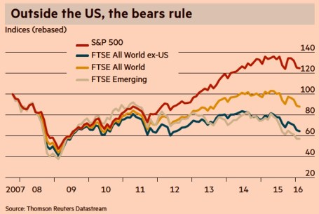
Source: Financial Times
Whether large companies, as measured by the S&P 500 index, which fell about -15% from the peak, suffer a true, technical -20% “bear market” or continue the current seven-year bull market is debatable. Regardless, what we do know is investors survived another cold winter and spring has produced a weather forecast that is currently predicting warmer weather and sunnier economic skies.

Wade W. Slome, CFA, CFP®
Plan. Invest. Prosper.
DISCLOSURE: Sidoxia Capital Management (SCM) and some of its clients hold positions in certain exchange traded funds (ETFs), but at the time of publishing had no direct position in any security referenced in this article. No information accessed through the Investing Caffeine (IC) website constitutes investment, financial, legal, tax or other advice nor is to be relied on in making an investment or other decision. Please read disclosure language on IC Contact page.
Extrapolation: Dangers of the Reckless Ruler

The game of investing would be rather simple if everything moved in a straight line and economic data points could be could be connected with a level ruler. Unfortunately, the real world doesn’t operate that way – data points are actually scattered continuously. In the short-run, inflation, GDP, exchange rates, interest rates, corporate earnings, profit margins, geopolitics, natural disasters, financial crises, and an infinite number of other factors are very difficult to predict with any accurate consistency. The true way to make money is to correctly identify long-term trends and then opportunistically take advantage of the chaos by using the power of mean reversion. Let me explain.
Take for example the just-released October employment figures, which on the surface showed a blowout creation of +271,000 new jobs during the month (unemployment rate decline to 5.0%) versus the Wall Street consensus forecast of +180,000 (flat unemployment rate of 5.1%). The rise in new workers was a marked acceleration from the +137,000 additions in September and the +136,000 in August. The better-than-expected jobs numbers, the highest monthly addition since late 2014, was paraded across television broadcasts and web headlines as a blowout number, which gives the Federal Reserve and Chairwoman Janet Yellen more ammunition to raise interest rates next month at the Federal Open Market Committee meeting. Investors are now factoring in roughly a 70% probability of a +0.25% interest rate hike next month compared to an approximately 30% chance of an increase a few weeks ago.
As is often the case, speculators, traders, and the media rely heavily on their trusty ruler to connect two data points to create a trend, and then subsequently extrapolate that trend out into infinity, whether the trend is moving upwards or downwards. I went back in time to explore the media’s infatuation with limitless extrapolation in my Back to the Future series (see Part I; Part II; and Part III). More recently, weakening data in China caused traders to extrapolate that weakness into perpetuity and pushed Chinese stocks down in August by more than -20% and U.S. stocks down more than -10%, over the same timeframe.
While most of the media coverage blew the recent jobs number out of proportion (see BOOM! Big Rebound in Job Creation), some shrewd investors understand mean reversion is one of the most powerful dynamics in economics and often overrides the limited utility of extrapolation. Case in point is blogger-extraordinaire Scott Grannis (Calafia Beach Pundit) who displayed this judgment when he handicapped the October jobs data a day before the statistics were released. Here’s what Grannis said:
The BLS’s estimate of private sector employment tends to be more volatile than ADP’s, and both tend to track each other over time. That further suggests that the BLS jobs number—to be released early tomorrow—has a decent chance of beating expectations.
Now, Grannis may not have guaranteed a specific number, but comparing the volatile government BLS and private sector ADP jobs data (always released before BLS) only bolsters the supremacy of mean reversion. As you can see from the chart below, both sets of data have been highly correlated and the monthly statistics have reliably varied between a range of +100k to +300k job additions over the last six years. So, although the number came in higher than expected for October, the result is perfectly consistent with the “slowly-but-surely” growing U.S. economy.
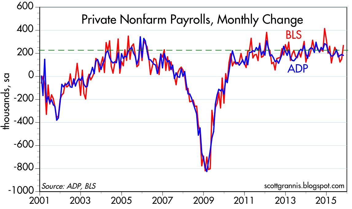
Source: Calafia Beach Pundit
While I spend much more time picking stocks than picking the direction of economic statistics, even I will agree there is a high probability the Fed moves interest rates next month. But even if Yellen acts in December, she has been very clear that this rate hike cycle will be slower than previous periods due to the weak pace of economic expansion. I agree with Grannis, who noted, “Higher rates would be a confirmation of growth, not a threat to growth.” Whatever happens next month, do yourself a favor and keep the urge of extrapolation at bay by keeping your pencil and ruler in your drawer.
Wade W. Slome, CFA, CFP®
Plan. Invest. Prosper.
DISCLOSURE: Sidoxia Capital Management (SCM) and some of its clients hold positions in certain exchange traded funds (ETFs) , but at the time of publishing, SCM had no direct position in any other security referenced in this article. No information accessed through the Investing Caffeine (IC) website constitutes investment, financial, legal, tax or other advice nor is to be relied on in making an investment or other decision. Please read disclosure language on IC Contact page.
Coast is Clear Until 2019

The economic recovery since the Great Financial Crisis of 2008-09 has been widely interpreted as the slowest recovery since World War II. Bill McBride of Calculated Risk captures this phenomenon incredibly well in his historical job loss chart (see red line in chart below):
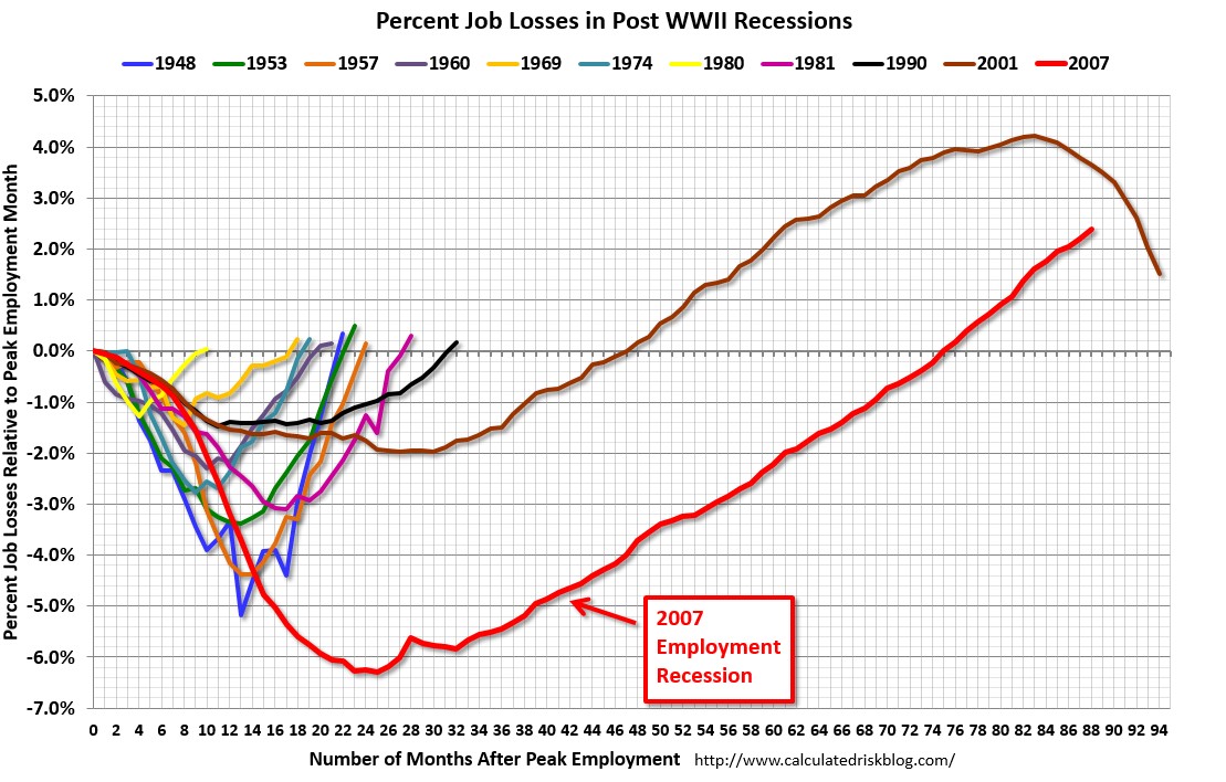
Source: Calculated Risk
History tells us that the economy traditionally suffers from an economic recession twice per decade, but we are closing in on seven years since the last recession with little evidence of impending economic doom.
So, are we due for another recession? Logic would dictate that since this recovery has been the slowest in a generation, the duration of this recovery should also be the longest. Strategist Ed Yardeni of Dr. Ed’s Blog uses data from historical economic cycles and CEI statistics (Coincident Economic Indicators) to make the same case. Based on his analysis, Yardeni does not see the next recession arriving until March 2019 (see chart below). If you take a look at the last five previous cycle peaks, recoveries generally last for an additional five and a half years (roughly 65 months). Since the last rebound to a cyclical peak occurred in October 2013, 65 months from then would imply the next downturn would begin in March 2019.
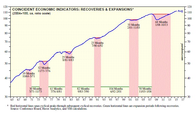
Source: Dr. Ed’s Blog
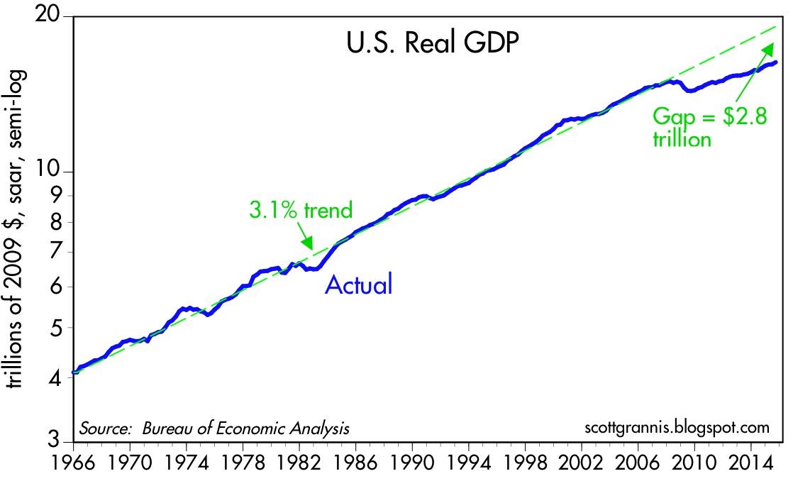
Typically, an economy loses steam and enters a recession after a phase of over-investment, tight labor conditions, and an extended period of tight central bank monetary policies. Over the last seven years, we have experienced quite the opposite. Corporations have been very slow to invest or hire new employees. For those employees hired, many of them are “under-employed” (i.e., working part-time), or in other words, these workers want more work hours. Our country’s slower-than-expected growth has created an output gap. Scott Grannis at Calafia Beach Pundit estimates this gap to approximate $2.8 trillion (see chart below). The CBO expects a smaller gap estimate of about $580 billion to narrow over the next few years. By Grannis’s calculations, there is a reservoir of 5 – 10 million jobs that could be tapped if the economy was operating more efficiently.
Source: Calafia Beach Pundit
Bolstering his argument, Grannis points out that the risk of a recession rises when there are significant capacity constraints and tight money. He sees the opposite happening – an enormous supply of unused capacity remains underutilized as he describes here:
“Today, money is abundant and resources are abundant. Even energy is abundant, because its price has fallen by over 50% in the past year or so. Corporate profits are near record highs, the supply of labor is virtually unconstrained, energy is suddenly cheap, and productive capacity is relatively abundant.”
While new uncertainties have been introduced (e.g., slowing China, potential government shutdown/sequestration, emerging market weakness), the reality remains there is always uncertainty. Even if you truly believe there is more uncertainty today relative to yesterday, the economy has some relatively strong shock absorbers to ride out the volatility.
There are plenty of potentially bad things to worry about, but if it’s a cyclical recession that you are worried about, then why don’t you grab a seat, order a coconut drink with an umbrella, and wait another three and a half years until you reach the circled date of March 2019 on your calendar.
Wade W. Slome, CFA, CFP®
Plan. Invest. Prosper.
DISCLOSURE: Sidoxia Capital Management (SCM) and some of its clients hold positions in certain exchange traded funds (ETFs) , but at the time of publishing, SCM had no direct position in any other security referenced in this article. No information accessed through the Investing Caffeine (IC) website constitutes investment, financial, legal, tax or other advice nor is to be relied on in making an investment or other decision. Please read disclosure language on IC Contact page.
Chicken or Beef? Time for a Stock Diet?

The stock market has been gorging on gains over the last six years and the big question is are we ready for a crash diet? In other words, have we consumed too much, too fast? Since the lows of 2009 the S&P 500 index has more than tripled (or +209% without dividends).
In our daily food diets our proteins of choice are primarily chicken and beef. When it comes to finances, our investment choices are primarily stocks and bonds. There are many factors that can play into a meat-eaters purchase decision, including the all-important factor of price. When the price of beef spikes, guess what? Consumers rationally vote with their wallets and start substituting beef for relatively lower priced chicken options.
The same principle applies to stocks and bonds. And right now, the price of bonds in general have gone through the roof. In fact bond prices are so high, in Europe we are seeing more than $2 trillion in negative yielding sovereign bonds getting sucked up by investors.
Another area where we see evidence of pricey bonds can be found in the value of current equity risk premiums. Scott Grannis of Calafia Beach Pundit posted a great 50-year history of this metric (chart below), which shows the premium paid to stockholders over bondholders is near the highest levels last seen during the Great Recession and the early 1980s. To clarify, the equity risk premium is defined as the roughly 5.5% yield currently earned on stocks (i.e., inverse of the approx. 18x P/E ratio) minus the 2.0% yield earned on 10-Year Treasury Notes.
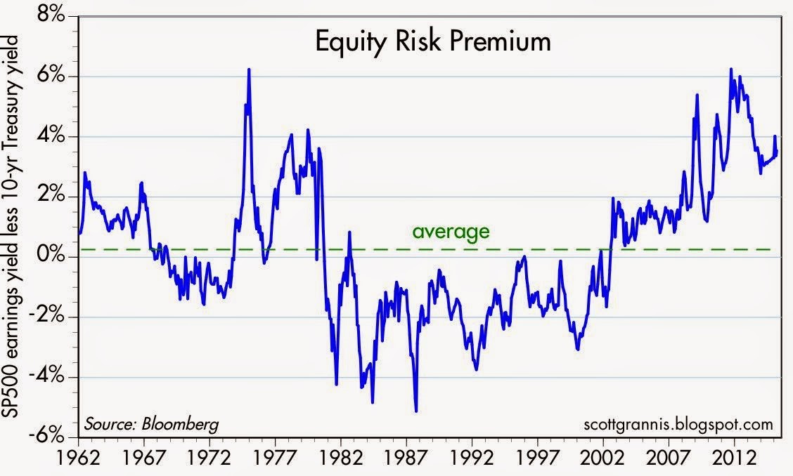
Source: Scott Grannis
The equity risk premium even looks more favorable if you consider the negative interest rate European environment mentioned earlier. The 60 billion euros of monthly debt in ECB (European Central Bank) quantitative easing purchases has accelerated the percentage of negative yield bond issuance, as you can see from the chart below.
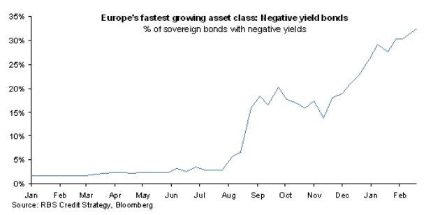
Source: FT Alphaville
Hibernating Bond Vigilantes
Dr. Ed Yardeni coined the famous phrase “bond vigilantes” to describe the group of hedge funds and institutional investors who act as the bond market sheriffs, ready to discipline any over leveraged debt-issuing entity by deliberately cratering prices via bond sales. For now, the bond vigilantes have in large part been hibernating. As long as the vigilantes remain asleep at the switch, stock investors will likely continue earning these outsized premiums.
How long will these fat equity premiums and gains stick around? A simple diet of sharp interest rate increases or P/E expansion would do the trick. An increase in the P/E ratio could come in one of two ways: 1) sustained stock price appreciation at a rate faster than earnings growth; or 2) a sharp earnings decline caused by a recessionary environment. On the bright side for the bulls, there are no imminent signs of interest rate spikes or recessions. If anything, dovish commentary coming from Fed Chairwoman Janet Yellen and the FOMC would indicate the economy remains in solid recovery mode. What’s more, a return to normalized monetary policy will likely involve a very gradual increase in interest rates – not a piercing rise as feared by many.
Regardless of whether it’s beef prices or bond prices spiking, rather than going on a crash diet, prudently allocating your money to the best relative value will serve your portfolio and stomach best over the long run.

Wade W. Slome, CFA, CFP®
Plan. Invest. Prosper.
DISCLOSURE: Sidoxia Capital Management (SCM) and some of its clients hold positions in certain exchange traded funds (ETFs), but at the time of publishing, SCM had no direct position in any other security referenced in this article. No information accessed through the Investing Caffeine (IC) website constitutes investment, financial, legal, tax or other advice nor is to be relied on in making an investment or other decision. Please read disclosure language on IC Contact page.
Stretching the High Yield Rubber Band

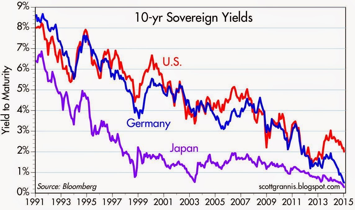
The 10-Year Treasury note recently pierced below the all-important psychological 2% level (1.97%), which has confounded many investors, especially if you consider these same rates were around 4% before the latest mega-financial crisis hit the globe. Some of the rate plunge can be explained by sluggish global growth, but the U.S. just logged a respectable +5.0% GDP growth quarter; corporate profits are effectively at all-time record highs; and the economy has added about 11 million private sector jobs over the last five years (unemployment rate of 10.0% has dropped to 5.6%). So what gives…why such low interest rates? Well, as I noted in a recent article (Why 0% Rates?), there is a whole host of countries with lower rates, which acts like an anchor dragging down our rates with them. Scott Grannis encapsulates this multi-decade, worldwide rate decline in the chart below:
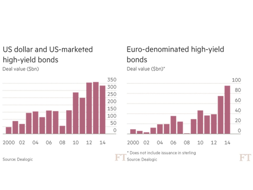
It should come as no surprise to many that these abnormally low rates have had a massive ripple effect on other asset classes… including of course high-yield bonds (aka “junk bonds”). It doesn’t take a genius or rocket scientist to discern the effects of an ultra-low interest rate environment. Quite simply, investors are forced to hunt for yield. When a Bank of America (BAC) customer is forced into earning less than 1/10th of 1 cent for every dollar invested in a CD, you can easily understand why the smile in their CD advertisement looks more like a grimace. Rather than accept $8 in annual interest on a $10,000 investment, post-crisis investors frightened by the stock market have piled into junk bonds. If you don’t believe me, check out the analysis provided by the Financial Times (data from Dealogic) in the chart below, which shows about $1 trillion in U.S. high-yield debt issuance over the last three years. Europe has experienced an even more dramatic growth rate in junk issuance compared to the U.S.
Stretching High-Yield Band
A rubber band can only stretch so far before the elasticity forces it too snap. We are getting closer to the snapping point, as more complacent investors lend money to riskier borrowers and also accept more lenient terms from issuers (e.g., cov-lite loans). Although default rates on high yield bonds remain near decade lows (1.1% through November 2014), high-yield investors keep on inching towards an ultimate day of reckoning. Thanks to a continually improving economy, Fitch Ratings is still projecting a benign default rate environment for high-yield bonds in 2015 – somewhere in the 1.5% – 2.0% range (see chart below). However, high-yield credit spreads did widen in 2014 with the help of crude oil prices getting chopped by more than -50% over the last year. Given the energy sector accounts for about 17% of the high-yield market (Barron’s), it would be natural to expect a larger number of energy company defaults to occur over the next 12-18 months, especially if crude oil prices remain depressed.
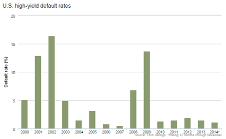
Source: Fitch Ratings
While it makes sense for you to hold a portion of your portfolio in high-yield bonds, especially for diversification purposes, don’t forget the power of mean reversion. The uncharacteristically low default rates will eventually revert towards historical averages. Stated differently, the increased risk profile of the high-yield bond market continues to stretch, so make sure you are not overly exposed to the sector because this segment will eventually snap.
Wade W. Slome, CFA, CFP®
Plan. Invest. Prosper.
DISCLOSURE: Sidoxia Capital Management (SCM) and some of its clients own a range of positions, including positions in certain exchange traded funds positions (JNK, HYG), and BAC, but at the time of publishing SCM had no direct position in any other security referenced in this article. No information accessed through the Investing Caffeine (IC) website constitutes investment, financial, legal, tax or other advice nor is to be relied on in making an investment or other decision. Please read disclosure language on IC Contact page.
Aaaaaaaah: Turbulence or Nosedive?

We’ve all been there on that rocky plane ride…clammy hands, heart beating rapidly, teeth clenched, body frozen, while firmly bracing the armrests with both appendages. The sky outside is dark and the interior fuselage rattles incessantly until….whhhhhssssshhh. Another quick jerking moment of turbulence has once again sucked the air out of your lungs and the blood from your heart. The rational part of your brain tries to assure you that this is normal choppy weather and will shortly transition to calm blue skies. The irrational and emotional, part of our brains (see Lizard Brain) tells us the treacherous plane ride is on the cusp of plummeting into a nosedive with passengers’ last gasps saved for blood curdling screams before the inevitable fireball crash.
Well, we’re now beginning to experience some small turbulence in the financial markets, and at the center of the storm is a collapsing Argentinean peso and a perceived slowing in China. In the case of Argentina, there has been a century-long history of financial defaults and mismanagement (see great Scott Grannis overview). Currently, the Argentinean government has been painted into a corner due to the depletion of its foreign currency reserves and financial mismanagement, as evidenced by an inflation rate hitting a whopping 25% rate.
On the other hand, China has created its own set of worries in investors’ minds. The flash Markit/HSBC Purchasing Managers’ Index (PMI) dropped to a level of 49.6 in January from 50.50 in December, which has investors concerned of a market crash. Adding fuel to the fear fire, Chinese government officials and banks have been trying to reverse excesses encountered in the country’s risky shadow banking system. While the size of Argentina’s economy may not be a drop in the bucket, the ultimate direction of the Chinese economy, which is almost 20x’s the size of Argentina’s, should be much more important to global investors.
At the end of the day, most of these mini-panics or crises (turbulence) are healthy for the overall financial system, as they create discipline and will eventually change irresponsible government behaviors. While Argentinean and Chinese issues dominate today’s headlines, these matters are not a whole lot different than what we have read about Greece, Ireland, Italy, Spain, Portugal, Cyprus, Turkey, and other negligent countries. As I’ve stated before, money goes where it’s treated best, and the stock, bond, and currency vigilantes ensure that this is the case by selling the assets associated with deadbeat countries. Price declines eventually catch the attention of politicians (remember the TARP vote failure of 2008?).
Is This the Beginning of the Crash?!
What goes up, must come down…right? That is the pervading sentiment I continually bump into when I speak to people on the street. Strategist Ed Yardeni did a great job of visually capturing the last six years of the stock market (below), which highlights the most recent bear market and subsequent major corrections. Noticeably absent in 2013 is any major decline. So, while many investors have been bracing for a major crash over the last five years, that scenario hasn’t happened yet. The S&P chart shows we appear to be due for a more painful blue (or red) period of decline in the not-too-distant future, but that is not necessarily the case. One would need only to thumb through the history books from 1990-1997 to see that investors lived through massive gains while avoiding any -10% correction – stocks skyrocketed +233% in 2,553 days. I’m not calling for that scenario, but I am just pointing out we don’t necessarily always live through -10% corrections annually.
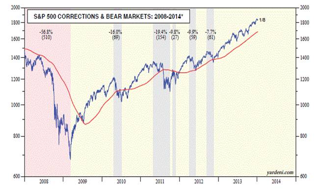
Source: Dr. Ed’s Blog
Even though we’ve begun to experience some turbulence after flying high in 2013, one should not panic. You may be better off watching the end of the airline movie before putting your head in between your legs in preparation for a nosedive.
Wade W. Slome, CFA, CFP®
Plan. Invest. Prosper.
DISCLOSURE: Sidoxia Capital Management (SCM) and some of its clients hold positions in certain exchange traded funds (ETFs), but at the time of publishing SCM had no direct position in any other security referenced in this article. No information accessed through the Investing Caffeine (IC) website constitutes investment, financial, legal, tax or other advice nor is to be relied on in making an investment or other decision. Please read disclosure language on IC Contact page.
Siegel & Co. See “Bubblicious” Bonds


Source: Wall Street Journal - March 14, 2000
Siegel compares 1999 stock prices with 2010 bonds
Unlike a lot of economists, Jeremy Siegel, Professor at the Wharton School of Business, is not bashful about making contrarian calls (see other Siegel article). Just days after the Nasdaq index peaked 10 years ago at a level above 5,000 (below 2,200 today), Siegel called the large capitalization technology market a “Sucker’s Bet” in a Wall Street Journal article dated March 14, 2000. Investors were smitten with large-cap technology stocks at the time, paying balloon-like P/E (Price-Earnings) ratios in excess of 100 times trailing earnings (see table above).
Bubblicious Boom

Today, Siegel has now switched his focus from overpriced tech-stock bubbles to “Bubblicious” bonds, which may burst at any moment. Bolstering his view of the current “Great American Bond Bubble” is the fact that average investors are wheelbarrowing money into bond funds. Siegel highlights recent Investment Company Institute data to make his point:
“From January 2008 through June 2010, outflows from equity funds totaled $232 billion while bond funds have seen a massive $559 billion of inflows.”
The professor goes on to make the stretch that some government bonds (i.e., 10-year Treasury Inflation-Protected Securities or TIPS) are priced so egregiously that the 1% TIPS yield (or 100 times the payout ratio) equates to the crazy tech stock valuations 10 years earlier. Conceptually the comparison of old stock and new bond bubbles may make some sense, but let’s not lose sight of the fact that tech stocks virtually had a 0% payout (no dividends). The risk of permanent investment loss is much lower with a bond as compared to a 100-plus multiple tech stock.
Making Rate History No Mystery
What makes Siegel so nervous about bonds? Well for one thing, take a look at what interest rates have done over the last 30 years, with the Federal Funds rate cresting over 20%+ in 1981 (View RED LINE & BLUE LINE or click to enlarge):

Source: dshort.com
As I have commented before, there is only one real direction for interest rates to go, since we currently sit watching rates at a generational low. Rates have a minute amount of wiggle room, but Siegel rightfully understands there is very little wiggle room for rates to go lower. How bad could the pain be? Siegel outlines the following scenario:
“If over the next year, 10-year interest rates, which are now 2.8%, rise to 3.15%, bondholders will suffer a capital loss equal to the current yield. If rates rise to 4% as they did last spring, the capital loss will be more than three times the current yield.”
Siegel is not the only observer who sees relatively less value in bonds (especially government bonds) versus stocks. Scott Grannis, author of the Calafia Report artfully shows the comparisons of the 10-Year Treasury Note yield relative to the earnings yield on the S&P 500 index:

Source: Calafia Report (Scott Grannis)
As you can see, rarely have there been periods over the last five decades where bonds were so poorly attractive relative to equities.
Grannis mirrors Siegel’s view on government bond prices through his chart on TIPS pricing:

Source: Calafia Report (Scott Grannis)
Pricey Treasuries is not a new unearthed theme, however, Siegel and Grannis make compelling points to highlight bond risks. Certainly, the economy could soften further, and trying to time the bottom to a multi-decade bond bubble can be hazardous to your investing health. Having said that, effectively everyone should desire some exposure to fixed income securities, depending on their objectives and constraints (retirees obviously more). The key is managing duration and the risk of inflation in a prudent fashion. If you believe Siegel is correct about an impending bond bubble bursting, you may consider lightening your Treasury bond load. Otherwise, don’t be surprised if you do not collect on another “sucker’s bet.”
Wade W. Slome, CFA, CFP®
Plan. Invest. Prosper.
*DISCLOSURE: Sidoxia Capital Management (SCM) and some of its clients own certain exchange traded funds (including TIP and other fixed income ETFs), but at the time of publishing SCM had no direct position in any security referenced in this article. No information accessed through the Investing Caffeine (IC) website constitutes investment, financial, legal, tax or other advice nor is to be relied on in making an investment or other decision. Please read disclosure language on IC “Contact” page.
Measuring the Market with Valuation Dipstick

Investor opinions about the stock market’s value are all over the map.
Doomsayers think the market is valued at crazy levels, and believe that “buy-and-hold” investing is dead. Bears remind investors that stocks have led to nothing good except for a lost decade of performance (read article on Lost Decade). Many speculators on the other hand believe they have the ability to “time the markets” to take advantage of volatility in any market (see also Market Timing article). In trader land, overconfidence is never in short-supply. Certainly, if you are a trader at Goldman Sachs (GS) or UBS and you are trading with privileged client data, then taking advantage of volatility can be an extremely lucrative endeavor. However most day-traders, and average investors, are not honored with the same information. Rather, the public gets overwhelmed by online brokerage firms and their plethora of software bells and whistles – inadequate protection when investing among a den of wolves. Equipping speculators with day trading tools is a little like giving a 7-year old a squirt gun and shipping them off to Afghanistan to fight the Taliban – the odds are not in the kid’s favor.
With so much uncertainty out in the marketplace, how do we know if the overall market is cheap or expensive? According to Scott Grannis, former Chief Economist at Western Asset Management and author of the Calafia Beach Pundit blog, the dipstick components necessary to measure the value of the market are corporate profits relative to the level of Gross Domestic Product (GDP) and the value (market cap) of the S&P 500 index. Grannis is a believer in the tenet that stock prices follow earnings, and as you can see from his charts below, earnings have grown much faster than stock prices over the last 10 years:
20 Year Chart

50 Year Chart

As you can see there is an extremely tight correlation on the 50-year chart until the last decade. What does the recent diverging trend mean? Here’s what Grannis has to say:
“Note that profits doubled from 1998 to 2009, yet the S&P 500 index today is still lower than it was at the end of 1998…equities continue to be extremely undervalued. Another way of looking at this is that the market is discounting current profits using an 8% 10-yr Treasury yield, or a 50% drop in corporate profits from here. Simply put, according to this model the market is priced to some very awful assumptions.”
How will this valuation gap be alleviated? Grannis correctly identifies two scenarios to achieve this end: 1) Rising treasury yields; and 2) Rising equity prices. His base case would be a move on the 10-year yield to 5.5%, and a move upwards in the S&P 500 index +50%.
Judging by Grannis’s dipstick measurement, there’s plenty of oil in the system to prevent the market engine from overheating just quite yet.
Read the Complete Scott Grannis Article
Wade W. Slome, CFA, CFP®
Plan. Invest. Prosper.
*DISCLOSURE: Sidoxia Capital Management (SCM) and some of its clients own certain exchange traded funds, but at the time of publishing SCM had no direct positions in GS, UBS, or any security referenced in this article. No information accessed through the Investing Caffeine (IC) website constitutes investment, financial, legal, tax or other advice nor is to be relied on in making an investment or other decision. Please read disclosure language on IC “Contact” page.


