Posts tagged ‘Robert Shiller’
Yellen is “Yell-ing” About High Stock Prices!

Earlier this week, Janet Yellen, chair of the U.S. Federal Reserve, spoke at the Institute for New Economic Thinking conference at the IMF headquarters in Washington, D.C. In addition to pontificating about the state of the global economy and the direction of interest rates, she also decided to chime in with her two cents regarding the stock market by warning stock values are “quite high.” She went on to emphasize “there are potential dangers” in the equity markets.
Unfortunately, those investors who have hinged their investment careers on the forecasts of economists, strategists, and Fed Chairmen have suffered mightily. Already, Yellen’s soapbox rant about elevated stock prices is being compared to former Fed Chairman Alan Greenspan’s “Irrational Exuberance” speech, which I have previously discussed on numerous occasions (see Irrational Exuberance Déjà Vu).
Greenspan’s bubble warning talk was given on December 5, 1996 when the NASDAQ closed around 1,300 (it closed at 5,003 this week). Greenspan specifically said the following:
“But how do we know when irrational exuberance has unduly escalated asset values, which then become subject to unexpected and prolonged contractions as they have in Japan over the past decade?”
After his infamous speech, the NASDAQ index almost quadrupled in value to 5,132 in the ensuing three years before cratering by approximately -78%,
Greenspan’s successor, economics professor Ben Bernanke, didn’t fare much better than the previous Fed Chairmen. Unlike many, I give full credit where credit is due. Bernanke deserves extra credit for his nimble but aggressive actions that helped prevent a painful recession from expanding into a protracted and lethal depression.
With that said, as late as May 2007, Bernanke noted Fed officials “do not expect significant spillovers from the subprime market to the rest of the economy.” Moreover, in 2005, near the peak in housing prices, Bernanke said the probability of a housing bubble was “a pretty unlikely possibility.” Bernanke went on to add housing price increases, “largely reflect strong economic fundamentals.” Greenspan concurred with Bernanke. Just a year prior, Greenspan noted that the increase in home values was “not enough in our judgment to raise major concerns.” History has proven how Bernanke and Greenspan could not have been more wrong.
If you still believe Yellen is the bee’s knees when it comes to the investing prowess of economists, perhaps you should review Long Term Capital Management (LTCM) debacle. In the midst of the 1998 Asian financial crisis, Robert Merton and Myron Scholes, two world renowned Nobel Prize winners almost single handedly brought the global financial market to its knees. Merton and Scholes used their lifetime knowledge of economics to create complex computerized investment algorithms. Everything worked just fine until LTCM lost $500 million in one day, which required a $3.6 billion bailout from a consortium of banks.
NASDAQ 5,000…Bubble Repeat?
Janet Yellen’s recent prognostication about the valuation of the U.S. stock market happens to coincide with the NASDAQ index breaking through the 5,000 threshold, a feat not achieved since the piercing of the technology bubble in the year 2000. Investing Caffeine readers and investors of mine understand today’s NASDAQ index is much different than the NASDAQ index of 15 years ago (see also NASDAQ Redux), especially when it comes to valuation. The folks at Bespoke put NASDAQ 5,000 into an interesting context by adding the important factor of inflation to the mix. Even though the NASDAQ index is within spitting distance of its all-time high of 5,132 (reached in 2000), the index would actually need to rally another +40% to reach an all-time “inflation adjusted” closing high (see chart below).

Source: Bespoke Investment Group
Economists and strategists are usually articulate, and their arguments sound logical, but they are notorious for being horribly bad at predicting the future, Janet Yellen included. I agree valuation is an all-important factor in determining future stock market returns. Howeer, by Robert Shiller, Janet Yellen, and a host of other economists relying on one flawed metric (CAPE PE), they have not only been wildly wrong year after year, but they are recklessly neglecting many other key factors (see also Shiller CAPE Smells Like BS).
I freely admit stocks will eventually go down, most likely a garden variety -20% recessionary decline in prices. While from a historical standpoint we are overdue for another recession (about two recessions per decade), this recovery has been the slowest since World War II, and the yield curve is currently not flashing any warning signals. When the eventual stock market decline happens, it likely will not be driven by high valuations. The main culprit for a bear market will be a decline in earnings – high valuations just act as gasoline on the fire. Janet Yellen will continue to offer her opinions on many aspects of the economy, but if she steps on her soapbox again and yells about stock market valuations, you will be best served by purchasing a pair of earplugs.

Wade W. Slome, CFA, CFP®
Plan. Invest. Prosper.
DISCLOSURE: Sidoxia Capital Management (SCM) and some of its clients hold positions in certain exchange traded funds (ETFs), but at the time of publishing, SCM had no direct position in any other security referenced in this article. No information accessed through the Investing Caffeine (IC) website constitutes investment, financial, legal, tax or other advice nor is to be relied on in making an investment or other decision. Please read disclosure language on IC Contact page.
Mathematics 101: The Cheap Money Printing Machine

Like many other bloggers and pundits, I have amply pontificated on the relative attractiveness of the stock market. For years, cash and gold hoarding bears have clung to the distorted, money-losing Shiller CAPE P/E ratio (see CAPE Smells Like B.S.), which has incorrectly signaled investors to stay out of stocks and miss trillions of dollars in price appreciation. Apparently, the ironclad Shiller CAPE device has been temporarily neutralized by the Federal Reserve’s artificially cheapening money printing press policies, just like Superman’s strength being stripped by the nullifying powers of kryptonite. The money printing logic seems so elegantly sound, I felt compelled to encapsulate this powerful relationship in an equation:
Interests Rate Cuts + Printing Press On = Stocks Go Higher
Wow, amazing…this is arithmetic any investor (or 3rd grader) could appreciate! Fortunately for me, I have a child in elementary school, so I became emboldened to share my new found silver bullet equation. I initially received a few raised eyebrows from my child when I introduced the phrase “Quantitative Easing” but it didn’t take long before she realized Rate Cuts + QE = Fat Piggy Bank.
After the intensive tutorial, I felt so very proud. With a smile on my face, I gave myself a big pat on the back, until I heard my child say, “Daddy, after looking at this squiggly S&P 500 line from 2007-2014, can you help my brain understand because I have some questions.”
Here is the subsequent conversation:
Me: “Sure kiddo, go ahead shoot…what can I answer for you?”
Child: “Daddy, if the Federal Reserve is so powerful and you should “not fight the Fed,” how come stock prices went down by -58% from 2007 – 2009, even though the Fed cut rates from 5.25% to 0%?”
Me: “Uhhhh….”
Child: “Daddy, if stock prices went down so much after massive rate cuts, does that mean stock prices will go up when the Fed increases rates?”
Me: “Uhhhh….”
Child: “Daddy, if Quantitative Easing is good for stock prices, how come after the QE1 announcement in November 2008, stock prices continued to go down -25%?”
Me: “Uhhhh….”
Child: “Daddy, if QE makes stocks go up, how come stock prices are at all-time record highs after the Fed has cut QE by -$70 billion per month and is completely stopping QE by 100% next month?”
Me: “Uhhhh….”
Child: “Daddy, everyone is scared of rate increases but when the Fed increased interest rates by 250 basis points in 1994, didn’t stock prices stay flat for the year?”
Me: “Uhhhh….” (See also 1994 Bond Repeat)
What started as a confident conversation about my bullet-proof mathematical equation ended up with me sweating bullets.
Math 101A: Low Interest Rates = Higher Asset Prices
As my previous conversation highlights, the relationship between rate cuts and monetary policy may not be as clear cut as skeptics would like you to believe. Although I enjoy the widely covered Shiller CAPE discussions on market valuations, somehow the media outlets fail to make the all-important connection between interest rates and P/E ratios.
One way of framing the situation is by asking a simple question:
Would you rather have $100 today or $110 a year from now?
The short answer is…”it depends.” All else equal, the level of interest rates will ultimately determine your decision. If interest rates are offering 20%, a rational person would select the $100 today, invest the money at 20%, and then have $120 a year from now. On the other hand, if interest rates were 0.5%, a rational person would instead select the option of receiving $110 a year from now because collecting a $100 today and investing at 0.5% would only produce $100.50 a year from now.
The same time-value-of-money principle applies to any asset, whether you are referring to gold, cars, houses, private businesses, stocks, or other assets. The mathematical fact is, all else equal, a rational person will always pay more for an asset when interest rates are low, and pay less when interest rates are high. As the 200-year interest chart below shows, current long-term interest rates are near all-time lows.
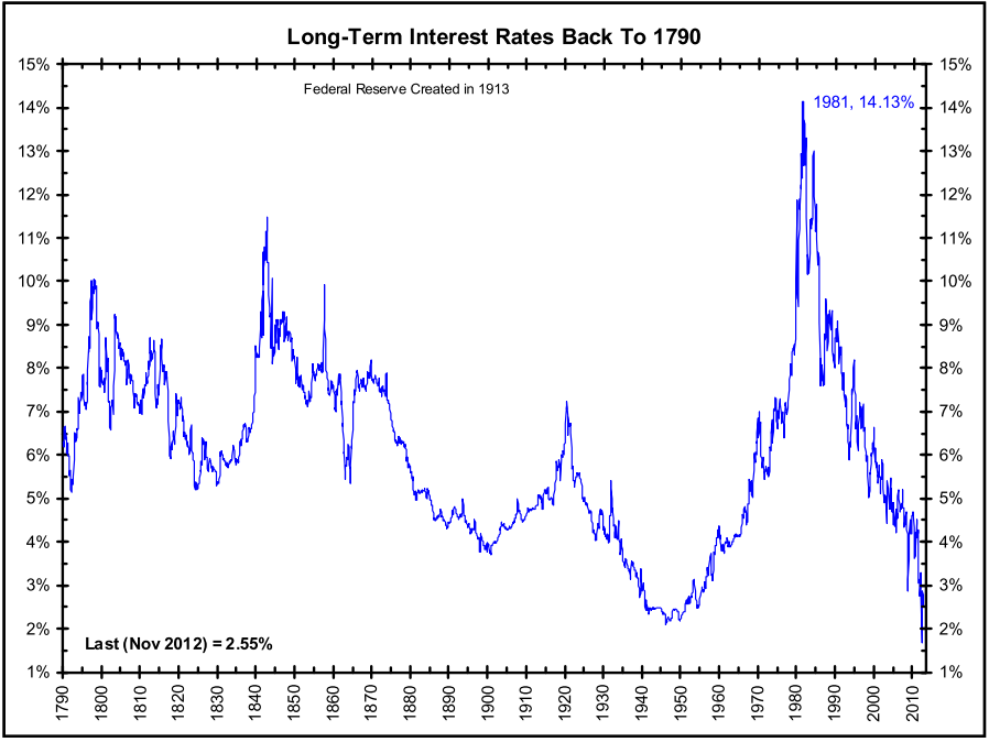
Source: The Big Picture
The peak in interest rates during the early 1980s correlated with a single digit P/E ratio (~8x). The current P/E ratio is deservedly higher (~16x), but it is dramatically lower than the 30x+ P/E ratio realized in the 2000 year timeframe. If none of this discussion makes sense, consider the simple Rule of 20 (see also The Rule of 20 Can Make You Plenty), which states as a simple rule-of-thumb, the average market P/E ratio should be equal to 20 minus the level inflation. With inflation currently averaging about 2%, the Rule of 20 implies an equilibrium of ~18x. If you assume this P/E multiple and factor in a 7-8% earnings growth rate, you could legitimately argue for 20% appreciation in the market to S&P 2,400 over a 12-month period. It’s true, a spike in interest rates, combined with a deceleration in earnings would justify a contraction in stock prices, but even under this scenario, current index values are nowhere near the bubble levels of 2000.
After six long years, the QE train is finally grinding to a halt, and a return towards Fed policy normalcy could be rapidly approaching. Many investors and skeptical bears have tried to rationalize the tripling in the market from early 2009 as solely due to the cheap Fed money printing machine. Unfortunately, history and mathematics don’t support that assertion. If you don’t believe me, perhaps a child may be able to explain it to you better.
Wade W. Slome, CFA, CFP®
Plan. Invest. Prosper.
DISCLOSURE: Sidoxia Capital Management (SCM) and some of its clients own a range of positions in certain exchange traded fund positions, but at the time of publishing SCM had no direct position in any other security referenced in this article. No information accessed through the Investing Caffeine (IC) website constitutes investment, financial, legal, tax or other advice nor is to be relied on in making an investment or other decision. Please read disclosure language on IC Contact page.
Shiller CAPE Peaches Smell Like BS

If something sounds like BS, looks like BS, and smells like BS, there’s a good chance you’re probably eyeball-deep in BS. In the investment world, I encounter a lot of very intelligent analysis, but at the same time I also continually step into piles of investment BS. One of those piles of BS I repeatedly step into is the CAPE ratio (Cyclically Adjusted Price-to-Earnings) created by Robert Shiller. For those who are not familiar with Shiller, he is a Nobel Prize winner in economics who won the award in 2013 for his work on the “empirical analysis of asset prices.” Shiller vaulted into fame in large part due to the timing of his book, Irrational Exuberance, which was published during the 2000 technology market peak. He gained additional street-credibility in the mid-2000s when he spoke about the bubble developing in the real estate markets.
What is the CAPE?
Besides being a scapegoat for every bear that has missed the tripling of stock prices in the last five years, the CAPE effectively is a simple 10-year average of the P/E ratio for the S&P 500 index. The logic is simple, like many theories in finance and economics, there often are inherent mean-reverting principles that are accepted as rules-of-thumb. It follows that if the current 10-year CAPE is above the 134-year CAPE average, then stocks are expensive and you should avoid them. On the other hand, if the current CAPE were below the long-term CAPE average, then stocks are cheap and you should buy. Here is a chart of the Shiller CAPE:
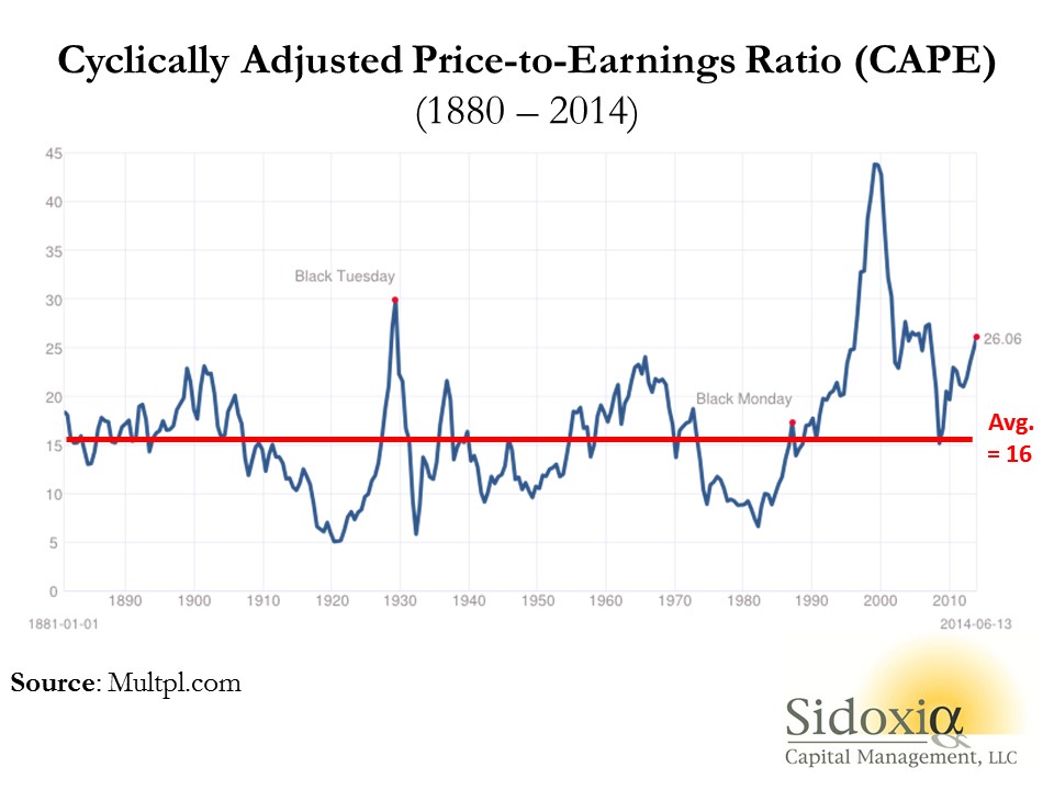
As you can see from the chart above, the current CAPE ratio of 26x is well above the 134-year average of 16x, which according to CAPE disciples makes the stock market very expensive. Or as a recent Business Insider article stated, the Shiller CAPE is “higher than at any point in the 20th century with the exception of the peaks of 1929 and 2000 – you know what happened after those.”
Problems Behind the Broken CAPE Tool
There are many problems with Shiller’s CAPE analysis, but let’s start with the basics by first asking, how useful has this tool actually been over the last, 10, 20, or 30 years? The short answer…not very. For example, if investors followed the implicit recommendation of the CAPE for the periods when Shiller’s model showed stocks as expensive (see above chart 1990 – 2014), they would have missed a more than quintupling (+469% ex-dividends) in the S&P 500 index. Over a shorter timeframe (2009 – 2014) the S&P 500 is up +114% ex-dividends (+190% since March 2009).
Even if you purchased at the worst time at the peak of the stock market in 2000 when the CAPE was 44 (S&P 500 – 1553), an investor would still have earned a total return of about +45% from 2000 – 2014, despite the CAPE still being 63% higher (more expensive) than the 134-year CAPE average of 16.
Peaches for $.25 Post-Bubble?
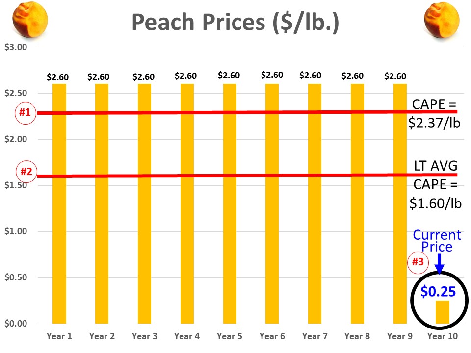
To illustrate a point, let’s assume you are a peach lover and due to a bubble in peach demand, prices spiked to an elevated level of $2.60 per pound for 9 years, but in year 10 the price plummeted to $.25 per pound today (see chart below). Assuming the 134-year average for peach prices was $1.60 per pound, would you still want to purchase your beloved peaches for the fire sale price of $.25 per pound? Common sense tells you $.25/lb. is a bargain, but if you asked the same question to Robert Shiller, he would say absolutely “NO”! The 10-year Peach CAPE ratio would be $2.37 ([9 yrs X $2.60] + [1 yr X $.25]) #1, but since the 10-year CAPE is greater than the LT-Average peach price of $1.60 per pound #2, Shiller would say peaches are too expensive, even though you could go to Kroger (KR) and buy a pound of peaches today for $0.25 #3.
This complete neglect of current market prices in the calculation of CAPE makes absolutely no sense, but this same dynamic of ignoring current pricing reality is happening today in the stock market. Effectively what’s occurring is the higher P/E ratios experienced over the last 10 years are distorting the Shiller CAPE ratio, thereby masking the true current value of stocks. In other words the current CAPE of 26x vastly exaggerates the pricey-ness of the actual S&P 500 P/E ratio of 16x for 2014 and 14x for 2015.
There are plenty of other holes to poke into CAPE, but the last major component of Shiller’s ratio I want to address is interest rates. Even if you disregard my previous negative arguments against Shiller’s CAPE, should anyone be surprised that the ratio troughed in the early 1980s of 7x when long-term interest rates peaked. If I could earn 18% on a CD with little risk in 1981, not many people should be dumbfounded that demand for risky stocks was paltry. Today, the reverse environment is in place – interest rates are near record lows. It should therefore come as no surprise, that all else equal, a higher P/E (and CAPE) is deserved when interest rates are this low. Nevertheless, this discussion of P/E and CAPE rarely integrates the critical factor of interest rates.
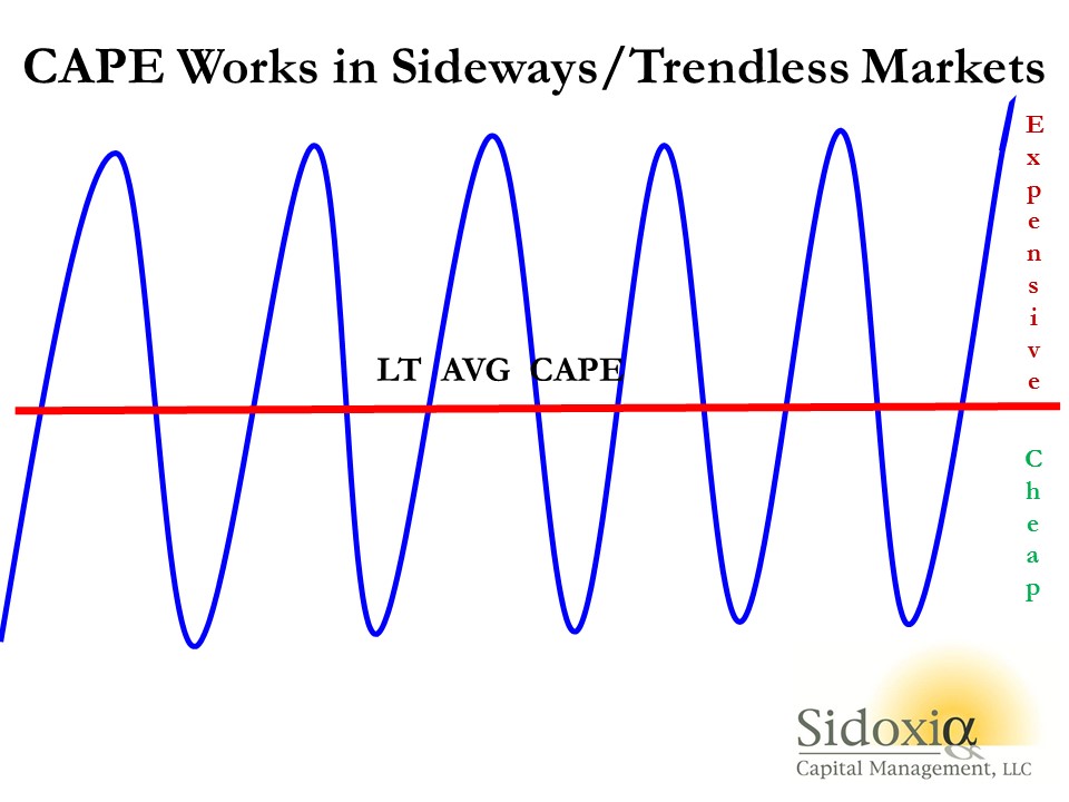
While I have spent a decent amount of time trashing the CAPE-BS ratio, I want to give my pal Bob Shiller a fair shake. I can do this by looking into a mirror and admitting there are periods when the CAPE ratio can actually work. Although the CAPE is effectively useless during long, multi-year upward and downward trending markets (think bubbles & depressions), the CAPE makes perfect sense in sideway, trendless markets (see chart below).
The investing public is always looking for a Holy Grail financial indicator that will magically guide them to riches in both up and down markets. Despite the popularity of Shiller’s CAPE ratio, regrettably no one perfect indicator exists. So before you jump on the bandwagon and chase the hot indicator du jour, make sure to look down and make sure you haven’t stepped in any Shiller CAPE-BS.
Wade W. Slome, CFA, CFP®
Plan. Invest. Prosper.
DISCLOSURE: Sidoxia Capital Management (SCM) and some of its clients hold long positions in certain exchange traded funds, but at the time of publishing SCM had no direct position in KR, or any other security referenced in this article. No information accessed through the Investing Caffeine (IC) website constitutes investment, financial, legal, tax or other advice nor is to be relied on in making an investment or other decision. Please read disclosure language on IC Contact page.
Damned if You Do, and More Damned if You Don’t

Source: Photobucket
In the stock market you are damned if you do, and more damned if you don’t.
There are a million reasons why the market should or can go down, and the press, media, and bears come out with creative explanations every day. The “Flash Crash,” debt ceiling debate, credit downgrades, elections, and fiscal cliff were all credible events supposed to permanently crater the market. Now we have higher taxes (capital gains, income, and payroll), sequester spending cuts, and a nagging recession in Europe. What’s more, the pessimists point to the unsustainable nature of elevated corporate profit margins, and use the ludicrous Robert Shiller 10-year Price-Earnings ratio as evidence of an expensive market (see also Foggy Rearview Mirror). If an apple sold for $10 ten days ago and $0.50 today, would you say, I am not buying an apple today because the 10-day average price is too high? If you followed Robert Shiller’s thinking, this logic would make sense.
Despite the barrage of daily concerns and excuses, the market continues to set new record highs and the S&P 500 is up by more than +130% since the 2009 lows – just a tad higher than the returns earned on cash, gold, and bonds (please note sarcasm). Cash has trickled into equities for the first few months of 2013 after years of outflows, but average investors have only moved from fear to skepticism (see also Investing with the Sentiment Pendulum ). With cash and bonds earning next to nothing; gold underperforming for years; and inflationary pressures eroding long-term purchasing power, the vice is only squeezing tighter on the worrywarts.
Are there legitimate reasons to worry? Certainly, and the opportunities are not what they used to be a few years ago (see also Missing the Pre-Party). Although an endangered species, long-term investors understand backwards looking economic news is useless. Or as Peter Lynch wisely stated, “If you spend 13 minutes a year on economics, you’ve wasted 10 minutes.” The fact remains that the market is up 70% of the time, on an annual basis, and has been a great place to beat inflation over time. It’s a tempting endeavor to avoid the down markets that occur 30% of the time, but those who try to time the market fail miserably over the long-run (see also Market Timing Treadmill).
Equity investors would be better served by looking at their investment portfolios like real estate. Homeowners implicitly know the value of their home changes on a daily basis, but there are no accurate, real-time quotes to reference your home value on a minute by minute basis, as you can with stocks. Most property owners know that real estate is a cyclical asset class that is not impacted by daily headlines, and if purchased at a reasonable price, will generally go up in value over many years. Unfortunately, for many average investors, equity portfolios are treated more like gambling bets in Vegas, and get continually traded based on gut instincts.
Volatility is at six-year lows, and investors are getting less uncomfortable with owning stocks. Although everybody and their mother has been waiting for a pullback (myself included), don’t get too myopically focused. For the vast majority of investors, who should have more than a ten year time horizon, you should understand that volatility is normal and recessions will cause stocks to gown significantly, twice every ten years on average. If you are a long-term investor, like you should be, and you understand these dynamics, then you will also understand that you will be more damned if you don’t invest in equities as part of a diversified portfolio.
Wade W. Slome, CFA, CFP®
Plan. Invest. Prosper.
DISCLOSURE: Sidoxia Capital Management (SCM) and some of its clients hold positions in certain exchange traded funds (ETFs), but at the time of publishing SCM had no direct position in any other security referenced in this article. No information accessed through the Investing Caffeine (IC) website constitutes investment, financial, legal, tax or other advice nor is to be relied on in making an investment or other decision. Please read disclosure language on IC Contact page.
P/E Binoculars, Not Foggy Rearview Mirror

Robert Shiller is best known for his correctly bearish forecasts on the housing market, which we are continually reminded of through the ubiquitous Case-Shiller housing index, and his aptly timed 2000 book entitled Irrational Exuberance. Shiller is also well known for his cyclically adjusted 10-year price-earnings tool, also known as P/E-10. This tool chooses to take a rearview mirror look at the 10-year rolling average of the S&P composite stock index to determine whether the equity market is currently a good or bad buy. Below average multiples are considered to be predictive of higher future returns, and higher than average multiples are considered to produce lower future returns (see scatterplot chart).

Source: http://www.mebanefaber.com (June 2010)
Foggy Mirror
If you were purchasing a home, would the price 10 years ago be a major factor in your purchase decision? Probably not. Call me crazy, but I would be more interested in today’s price and even more interested in the price of the home 10 years into the future. The financial markets factor in forward looking data (not backward looking data). Conventional valuation techniques applied to various assets, take for example a bond, involve the discounting of future cash flow values back to the present – in order to determine the relative attractiveness of today’s asset price. The previous 10-years of data are irrelevant in this calculation.
Although I believe current and future expectations are much more important than stale historical data, I can appreciate the insights that can be drawn by comparing current information with historical averages. In other words, if I was purchasing a house, I would be interested in comparing today’s price to the historical 10-year average price. Currently, the P/E-10 ratio stands at a level around 22x – 38% more expensive than the 16x average value for the previous decade. That same 22x current P/E-10 ratio compares to a current forward P/E ratio of 13x. A big problem is the 22x P/E-10 is not adequately taking into account the dramatic growth in earnings that is taking place (estimated 2010 operating earnings are expected to register in at a whopping +45% growth).

Mean P/E 10 Value is 16.4x Source: http://www.multpl.com
Additional problems with P/E-10:
1) The future 10 years might not be representative of the extreme technology and credit bubble we experienced over the last 10 years. Perhaps excluding the outlier years of 2000 and 2009 would make the ratio more relevant.
2) The current P/E-10 ratio is being anchored down by extreme prices from a narrow sector of technology a decade ago. Value stocks significantly outperformed technology over the last 10 years, much like small cap stocks outperformed in the 1970s when the Nifty Fifty stocks dominated the index and then unraveled.
3) Earnings are rising faster than prices are increasing, so investors waiting for the P/E-10 to come down could be missing out on the opportunity cost of price appreciation. The distorted P/E ratios earlier in the decade virtually guarantee the P/E-10 to drop, absent a current market melt-up, because P/E ratios were so high back then.
4) The tool has been a horrible predictor over very long periods of time. For example, had you followed the tool, the red light would have caused you to miss the massive appreciation in the 1990s, and the green light in the early 1970s would have led to little to no appreciation for close to 10 years.
Shiller himself understands the shortcomings of P/E-10:
“It is also dangerous to assume that historical relations are necessarily applicable to the future. There could be fundamental structural changes occurring now that mean that the past of the stock market is no longer a guide to the future.”
How good an indicator was P/E-10 for the proponent himself at the bottom of the market in February 2009? Shiller said he would get back in the market after another 30% drop in the ratio (click here for video). As we know, shortly thereafter, the market went on a near +70% upwards rampage. I guess Shiller just needs another -55% drop in the ratio from here to invest in the market?
Incidentally, Shiller did not invent the cyclically adjusted P/E tool, as famed value investor Benjamin Graham also used a similar tool. The average investor loves simplicity, but what P/E-10 offers with ease-of-use, it lacks in usefulness. I agree with the P/E-10 intent of smoothing out volatile cycle data (artificially inflated in booms and falsely depressed in recessions), but I recommend investors pull out a pair of binoculars (current and forward P/Es) rather than rely on a foggy rearview mirror.
Wade W. Slome, CFA, CFP®
Plan. Invest. Prosper.
DISCLOSURE: Sidoxia Capital Management (SCM) and some of its clients own certain exchange traded funds, but at the time of publishing SCM had no direct position in any other security referenced in this article. No information accessed through the Investing Caffeine (IC) website constitutes investment, financial, legal, tax or other advice nor is to be relied on in making an investment or other decision. Please read disclosure language on IC “Contact” page.


